Best Kitchen Colour Combination Ideas for Your Space
How to Guides


Picking the right kitchen colour combination isn’t as easy as it seems. In most Indian homes, the kitchen is more than a cooking place. It’s where families gather, share conversations, and create memories. And when it comes to choosing colours, the decisions get tricky.
You start wondering, will this colour fade or look dull over time? Will stains show too easily? Will it go well with my old wooden cabinets and new steel appliances?
Finding a shade that won’t clash with your utensils, hides turmeric marks, and balances brightness with warmth takes a little thought. In Indian homes, kitchen colours need to be practical, easy to maintain, and welcoming at the same time.
In this blog, we explore the 10 best kitchen colour combination ideas for your space, each with detailed explanations and practical tips to help you make informed design choices.
Benefits of Choosing Perfect Colour for Indian Kitchens
Choosing the right colour scheme can elevate the kitchen’s ambience, enhance functionality, and even align with Vastu principles for a more positive environment. Whether you prefer warm, spicy tones or cool, calming hues, the perfect colour choice can transform your kitchen into a space that reflects style and substance.
Here are the key benefits of selecting the perfect kitchen colour:
Enhances Mood and Energy: Bright colours like yellow, orange, or red stimulate energy and appetite, making the kitchen a cheerful space to cook and gather.
Improves Space Perception: Lighter shades like white, beige, or pastel tones can make small Indian kitchens appear more spacious and airy.
Boosts Lighting Efficiency: Reflective colours help maximise natural and artificial lighting, reducing the need for extra light fixtures.
Adds Cultural Connection: Traditional Indian colours like turmeric yellow, curry red, or peacock blue create a cultural aesthetic rooted in heritage.
Supports Vastu Principles: According to Vastu Shastra, specific colours can bring balance and positive energy—for instance, warm tones in the southeast kitchen are considered auspicious.
Defines Functionality: Colour zoning (using different shades for cabinets, walls, or backsplashes) can help visually separate cooking, prep, and storage areas.
Increases Property Value: A well-coloured, visually appealing kitchen often attracts buyers and can boost resale value.
Best Kitchen Colour Combination Ideas
Choosing the right colour combinations for your kitchen can transform its look and feel completely. In Indian homes, where kitchens are often high-traffic zones filled with warmth, spices, and tradition, the colour palette plays a crucial role in setting the tone.
Let’s get into knowing the best kitchen colour combination ideas:
1. White and Wood
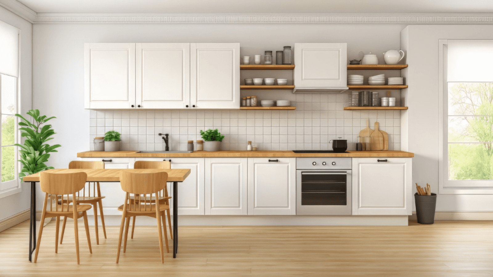
You're not alone if you’ve avoided white in your kitchen, fearing it’ll get dirty too fast or look too plain. In most Indian homes, kitchens face turmeric stains, oil splashes, and daily spills. An all-white setup can feel impractical, but pairing it with wood tones makes a big difference.
White brightens compact, closed-off kitchens, especially in city apartments with limited natural light, making them feel bigger and fresher. Adding wooden cabinets, shelves, or a breakfast counter brings warmth and texture to avoid that cold, clinical look. Wood grains cleverly mask minor stains and scratches, making your kitchen feel welcoming and easy to maintain.
Why It Works:
Bright and Airy: White surfaces bounce light around the room, making it more open and spacious.
Inviting Warmth: Wood accents break the monotony and prevent the space from feeling too clinical.
Style-Friendly: This combination blends seamlessly with Scandinavian, farmhouse, Japandi, or modern aesthetics, making it versatile.
Design Tips:
Two-Tone Cabinets: Choose white cabinets on top to enhance brightness and wood-toned cabinets on the bottom to anchor the design visually.
Natural Countertops: Butcher block countertops reinforce the organic theme and add tactile interest.
Accessorise Smartly: Introduce potted herbs, succulents, or even trailing plants for freshness. Use black hardware for a sleek, contemporary touch.
This combination is ideal for homeowners who want a kitchen that feels fresh, calming, and connected to nature.
2. Navy Blue and Brass

If your kitchen often feels too bright or lacks character, navy blue is a practical way to add depth. In many Indian apartments and urban homes with open layouts and strong ceiling lights, darker shades help reduce glare and make the space feel more balanced. Navy tones work especially well in neutral or large kitchens that can otherwise look too plain.
Brass accents pair well with navy, adding warmth and breaking up the heaviness of dark colours. Simple touches like cabinet handles, faucets, or pendant lights in brass can soften the overall look without overpowering the space. Together, navy blue and brass create a kitchen that feels inviting, balanced, and a little more refined, without losing everyday functionality.
Why It Works:
Deep and Dramatic: Navy offers a bold base without the starkness of black, allowing for a dramatic yet livable space.
Luxe Accents: Brass adds glamour, balancing the moody tones with warmth and polish.
Ideal for Spacious Layouts: Works exceptionally well in larger or open-plan kitchens where darker colours won’t overwhelm the space.
Design Tips:
Statement Cabinets: Choose matte or lacquered navy cabinetry as the hero element.
Elegant Fixtures: Use brushed brass for cabinet handles, taps, and pendant lights to add visual intrigue.
Contrast Smartly: Pair white or light grey countertops and marble or quartz backsplashes to avoid a heavy look.
This combination best suits those who appreciate bold design choices and want their kitchen to feel rich and refined.
3. Olive Green and Cream
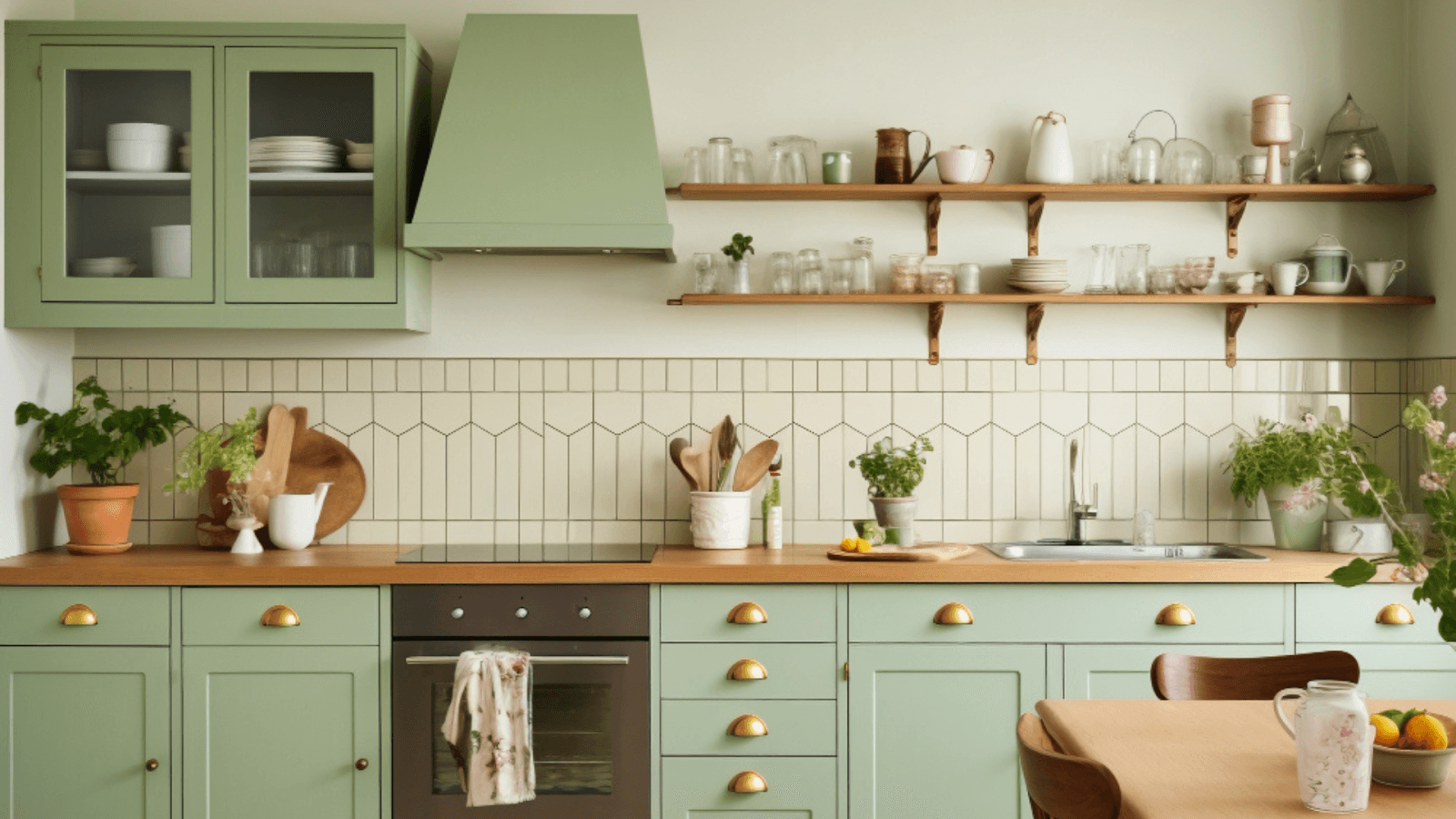
If your kitchen feels too bright, cold, or lacking warmth, olive green is a solid way to soften it. In Indian homes, where metal appliances and glossy tile finishes are common, this earthy shade cuts through the harshness and adds a calm, natural touch. It works well in busy kitchens, making the space feel more relaxed.
Pairing it with cream keeps the space from becoming too dark or heavy. Cream tones reflect enough light to keep things airy without being too stark, making them ideal for kitchens with limited natural light. The combo is beneficial if you aim for a peaceful, lived-in look that hides minor stains or wear, while still feeling elegant and warm.
Why It Works:
Soft Yet Distinctive: Olive provides character without being overwhelming, and cream keeps things light and neutral.
Perfect for Texture Lovers: Complements natural wood, rattan, terracotta, and aged metals.
Style Versatility: Fits well with rustic, bohemian, Mediterranean, and even transitional styles.
Design Tips:
Layered Cabinets: Apply olive green to lower cabinets or islands, and use cream tones on upper cabinetry for visual balance.
Curated Fixtures: Opt for matte black or brushed gold hardware to elevate the design without clashing with the earthy tones.
Add Organic Elements: To complete the natural vibe, introduce clay planters, jute rugs, linen curtains, or vintage wooden shelves.
This colour combination is a favourite for creating kitchens that feel like a peaceful retreat with strong ties to nature.
4. Charcoal Grey and White

If your kitchen tends to show stains easily or feels too bland, the charcoal grey and white combo offers a practical and stylish fix. In Indian kitchens, where countertops and cabinets face daily wear from cooking oils, masalas, and spills, charcoal grey helps mask smudges and dirt, keeping things looking cleaner for longer.
White, meanwhile, brightens up the darker tone and ensures the kitchen doesn't feel too closed in. This is especially useful in smaller apartments or spaces with limited light. The contrast between the two creates a sharp, modern look that still feels balanced and livable. It’s perfect for homeowners who want a contemporary kitchen that’s easy to maintain and visually striking.
Why It Works:
High Contrast: Charcoal grey's boldness juxtaposed with white's crispness creates an eye-catching, dramatic, refined, edgy effect.
Sleek Lines and Simplicity: Charcoal grey amplifies the clean lines of modern and industrial designs, allowing the kitchen to feel streamlined and clutter-free.
Intimate Vibe: While the palette is modern, charcoal grey's deep tones add a cosy and intimate atmosphere to the space, making it feel comfortable without losing its chic appeal.
Design Tips:
Two-Tone Cabinets: Charcoal grey cabinets and white marble countertops (classic Carrara or subtle grey veining) create a luxurious and balanced look.
White Walls or Open Shelving: Keep the walls bright with white tiles or open shelving to prevent the space from feeling too dark, ensuring the balance between light and dark remains intact.
Metallic Accents: Incorporate metallic appliances or grey-toned flooring to tie the look together seamlessly. Stainless steel or brushed nickel can add a touch of modernity.
This combination works best for those who want a bold yet sleek, polished kitchen without sacrificing warmth and comfort.
5. Mint Green and White
If your kitchen feels dull or visually heavy, especially in homes with darker cabinetry or limited airflow, mint green can instantly lift the mood. Its cool, pastel tone adds a breezy, refreshing vib,e which is perfect for kitchens that need a break from the usual dark or neutral palettes. Mint also subtly conceals small splashes or stains, which makes it a low-maintenance yet cheerful choice.
Pairing it with white enhances natural brightness, making compact or enclosed kitchens feel more open and airy. It’s a smart pick for older apartments or homes with limited space and light. Together, mint green and white create a playful yet clean look that feels energizing and easy to live with.
Why It Works:
Space Enhancing: Mint green and white create an illusion of more space, making it an excellent option for smaller kitchens or apartments.
Vintage or Modern Appeal: Depending on how it's styled, this combination can evoke a nostalgic, retro vibe or a more modern, clean aesthetic.
Promotes Calmness and Creativity: The mint green tone is associated with calmness and creativity, making it an excellent backdrop for culinary adventures.
Design Tips:
Mint Green Cabinets: To keep the space light and airy, consider painting lower cabinets or an island mint green, paired with white tile backsplashes.
Pastel or Copper Accents: To enhance the charm, add playful touches with pastel-colored or copper accessories such as handles, lighting, or dishware.
Wooden Elements: Incorporate wood accents (such as wooden countertops or a wooden table) to add warmth and prevent the room from feeling too cold or sterile.
This combination shines in cottage, coastal, or retro-inspired kitchens, making it perfect for those who want their kitchen to feel cheerful and relaxed.
6. Black and Gold
If your kitchen often feels too plain or lacks visual impact, black and gold can solve that by adding instant drama and depth. In Indian homes with open layouts or spacious kitchens, black helps define zones and hides everyday stains like oil marks or smudges, making it a practical base for high-use areas.
Gold accents, whether it’s cabinet handles, light fittings, or taps, bring just the right amount of warmth to a darker kitchen. They stop the space from feeling too heavy or dull, especially under artificial lights, which are common in most Indian homes. It’s a practical way to add a hint of elegance without making the kitchen high-maintenance. Ideal if you want your space to feel rich, stylish, and easy to live with.
Why It Works:
High Contrast and Bold Impact: The combination of black and gold creates a striking visual contrast that demands attention and creates a lasting impression.
Warmth with Prestige: While black can feel imposing, the gold elements bring warmth and a sense of luxury, transforming the space into something elegant and sophisticated.
Perfect for Modern and Art Deco Styles: This colour combination fits seamlessly with modern or Art Deco-inspired designs, adding a glamorous touch without feeling dated.
Design Tips:
Matte Black Cabinets: Matte black cabinets paired with gold hardware (handles, knobs, light fixtures) create a stunning, high-end look.
Glass or Mirrored Elements: Incorporate glass-front cabinets or mirrored backsplashes to enhance the elegance and reflect light, preventing the space from feeling too heavy.
Warm Lighting: Use soft, warm lighting to highlight the gold accents, ensuring the space feels inviting rather than overly dark.
This dramatic pairing is perfect for homeowners who want a kitchen that oozes luxury and sophistication while making a bold design statement.
7. Pastel Blue and Grey

Pastel blue offers a soothing solution if your kitchen feels too chaotic or overstimulating, especially in busy households. Its soft, airy tone helps tone down visual clutter and introduces a sense of calm, making it ideal for families that treat the kitchen as a cooking and gathering space. It’s also helpful in keeping the space from feeling too warm during hot Indian summers.
Pairing it with grey adds structure and balance. Grey acts as a neutral anchor, preventing the pastel from feeling too childlike or washed out. It also helps conceal dust and grime, especially on lower cabinets or flooring. Pastel blue and grey create a peaceful, low-maintenance kitchen that’s both refreshing and refined, perfect for homes that need calm without compromising style.
Why It Works:
Relaxing Cool Tones: The blend of blue and grey creates a soothing and harmonious atmosphere, perfect for kitchens that need to feel calm and inviting.
Elegant and Versatile: This combination works well for those who appreciate subtle elegance and want a bit of colour without overwhelming the space.
Great for Neutral Lovers: While the pastel blue provides a pop of colour, the grey ensures that the overall design remains soft and understated.
Design Tips:
Pastel Blue Walls or Cabinets: Soft pastel blue walls or cabinetry combined with grey countertops or islands can create a refreshing, airy atmosphere.
Chrome or Silver Fixtures: Opt for silver or chrome hardware to complement the cool tones and maintain a sleek, modern aesthetic.
White Elements: Incorporate white tiles or open shelving to maintain brightness in the space and prevent the pastel tones from feeling too muted.
This colour combination is perfect for those who appreciate subtle elegance and want a sophisticated, calm kitchen with just a hint of refreshing colour.
8. Mustard Yellow and White
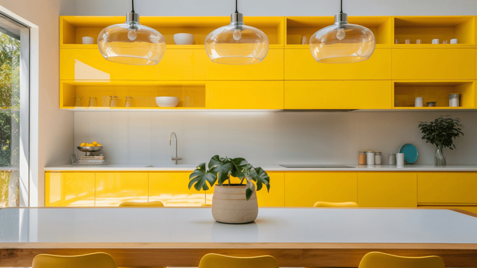
If your kitchen often feels dim or lacks natural light, a common issue in many Indian apartments, mustard yellow can be a smart fix. Its warm, energetic tone instantly brightens up the space, making it feel more cheerful and inviting even on overcast days or in windowless layouts.
Pairing it with white enhances this brightness, ensuring the space doesn’t become overwhelming. White adds contrast, helps reflect light, and keeps things balanced and clean. This combination is invaluable in turning compact or underlit kitchens into lively, welcoming hubs for the whole family. It is also easy to maintain and full of personality.
Why It Works:
Warmth Without Overload: Mustard yellow injects energy and cheerfulness without being overwhelming, making it a fantastic accent colour for kitchens.
Bright and Clean Aesthetic: White balances the intensity of mustard, creating a clean, polished look that helps light bounce around the room.
Inviting and Energising: This combination brings a positive vibe to the kitchen, ideal for morning breakfasts and casual family gatherings.
Design Tips:
Feature Wall Focal Point: Paint a single wall in mustard yellow to make a bold statement while keeping the rest of the kitchen neutral.
White Cabinets for Balance: Keep cabinetry white to maintain brightness and avoid colour fatigue. It also allows mustard accents to stand out.
Add Texture with Tiles or Terrazzo: Vintage-style tiles or terrazzo countertops with mustard specks can introduce pattern and depth.
Black for Contrast: Use matte black handles, light fixtures, or appliances to tone down the vibrancy and anchor the colour palette.
Perfect for eclectic, retro, or boho-style kitchens, this combination breathes life into any cooking space and ensures every meal starts with a smile.
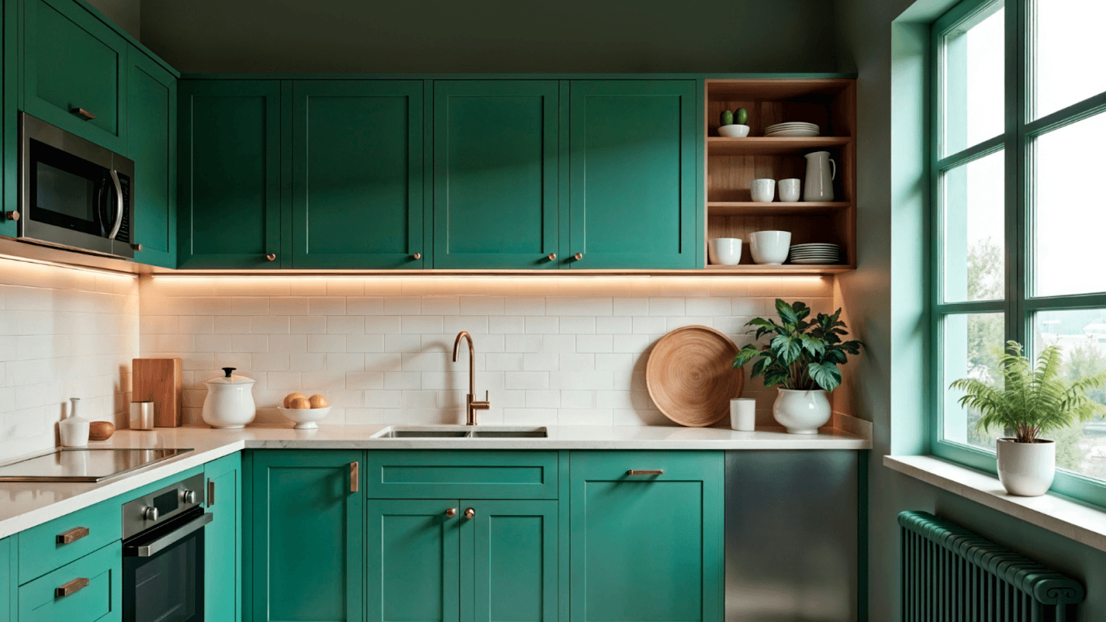
9. Forest Green and Matte Black
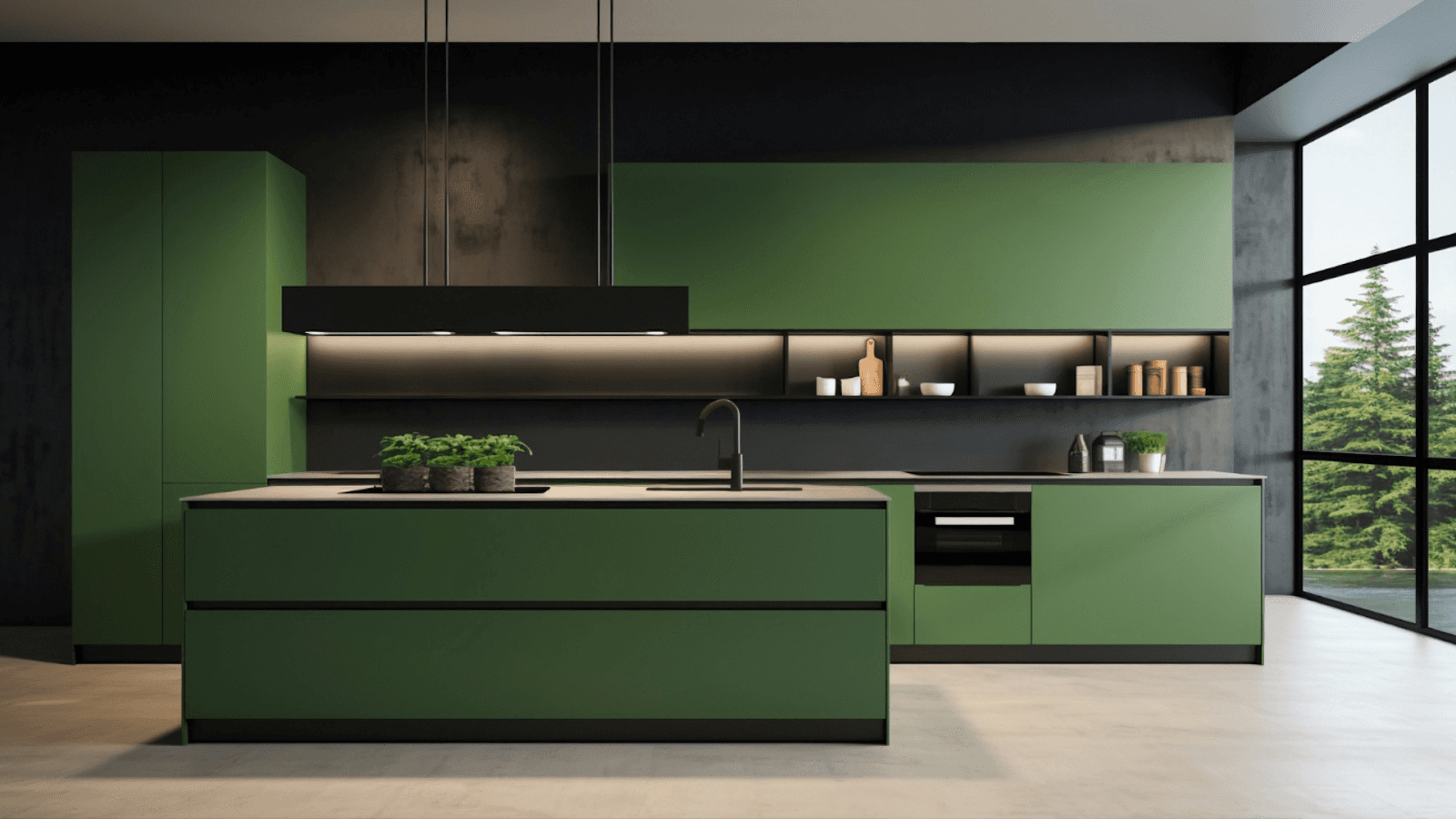
If your kitchen feels too sterile or lacks personality, especially in modern apartments filled with neutral finishes, forest green brings a much-needed connection to nature. It adds depth and a sense of calm, making it perfect for households seeking a more grounded, serene space amidst daily chaos.
Pairing it with matte black adds a sleek, contemporary edge without overpowering the room. Matte finishes help reduce the visibility of fingerprints and smudges—ideal for high-touch areas like cabinets and handles. This combination is beneficial for creating a high-impact, low-maintenance kitchen that feels bold and balanced, with a touch of luxurious charm.
Why It Works:
Earthy and Sophisticated: Forest green connects the indoors to the outdoors, offering a grounded, calming vibe. Matte black adds depth and contrast.
Refined and Bold: Both colours are saturated and dark, which makes the space feel luxurious and deliberate. This isn’t a combination for the faint-hearted—it’s for those who love daring style.
Perfect for Natural Light: These tones' richness shines best in kitchens with abundant natural light, which balances their heaviness.
Design Tips:
Cabinetry Meets Contrast: For a sleek, unified look, opt for forest green cabinetry paired with matte black countertops, hardware, or appliances.
Natural Accents: To soften the boldness, add warm, organic elements like exposed wood shelving, butcher block counters, or oak flooring.
Luxe Metallic Finishes: Bring in brass or antique gold fixtures for a refined finish that warms up the colour palette and adds sophistication.
Statement Lighting: Use pendant lighting or open fixtures to create focal points and break up the darker tones.
This colour combination is ideal for modern rustic, urban luxe, or Scandinavian-inspired, cosy, dramatic kitchens.
10. Grey and Yellow

Yellow can be a bright and practical solution if your kitchen feels too monotonous or lacks energy, especially in urban homes with limited sunlight. It instantly livens up the space, making mornings feel more cheerful and the kitchen more inviting for family gatherings or quick bites.
Grey, as a base, brings balance. It neutralizes the boldness of yellow and hides everyday stains, fingerprints, and wear, perfect for city apartments where function matters just as much as style. Together, grey and yellow strike the right balance between practicality and personality, creating a vibrant yet easy-to-maintain kitchen that feels fresh, modern, and full of life.
Why It Works:
Balance of Neutral and Vibrant: Grey tones down the brightness of yellow, making the overall palette feel harmonious rather than chaotic.
Uplifting Energy: Yellow stimulates mental activity and energy, which you need in a space where you start your day.
Urban Chic Appeal: The pairing feels modern, optimistic, and grounded, ideal for apartments or homes with an industrial or minimalist edge.
Design Tips:
Grey Cabinets, Yellow Accents: For a playful yet polished look, try sleek grey cabinetry paired with a bold yellow backsplash or accent wall.
White Elements for Clarity: White countertops or upper cabinets can help break up the colour blocks and maintain a sense of openness.
Add Greenery: Small potted plants or hanging herbs complement this colour combo perfectly, softening it with a natural touch.
Use Geometric Shapes: Introduce geometric tiles, open shelving, or modern pendant lights to enhance the urban aesthetic.
This kitchen colour combination is excellent for those who want a minimalist base with playful energy—stylish, space-efficient, and personality-filled.
Need Help Picking the Right Kitchen Colour? Let Tint Tone and Shade Assist You!
Our expert colour consultancy service helps create a stunning, functional, personalised kitchen space.
We offer:
Tailored colour palettes based on your style
Expert advice on paint types, finishes, and placement
Visual samples and swatches to bring your vision to life
Seamless coordination with your decor and lighting
Avoid costly mistakes and design with confidence. Book your colour consultation with Tint Tone and Shade today!
Now that you’ve learned about some stunning colour combinations, let’s explore practical tips for perfecting your kitchen's palette.
Tips to Choose the Right Kitchen Colour Combination

Choosing the right kitchen colour combination is crucial because it sets the tone for one of the most-used spaces in your home. A good mix of practicality, aesthetics, and personal taste can transform your kitchen into a welcoming and inspiring area.
Below are detailed tips to help you select the ideal colours:
1. Consider Natural Light
Lighting plays a significant role in how colours appear in your kitchen. In spaces with limited natural light, it's best to opt for lighter shades such as soft whites, cream, pastel blue, or mint green, as these colours reflect light and make the kitchen feel more open and airy.
2. Match with Fixtures
Your chosen colours should complement your existing fixtures, including countertops, cabinets, flooring, and appliances. For example, cooler tones like grey, icy blue, or white can enhance the sleek look if you have stainless steel appliances.
3. Go for Two or Three Colours
Limiting your palette to two or three colours creates a balanced and visually appealing space. A triadic scheme—choosing three colours evenly spaced on the colour wheel—adds vibrancy and personality without cluttering the kitchen.
A standard formula is to use:
One dominant colour (for cabinets or walls),
One secondary colour (for backsplash or furniture), and
One accent colour (for accessories or decor).
This method ensures you maintain visual interest while keeping the space unified. For example, a kitchen could feature navy cabinets (dominant), soft grey walls (secondary), and brass fixtures (accent).
4. Test Before You Paint
Paint looks different under various lighting conditions and times of day. What seems perfect under store lighting might look entirely different in your home. Always test a few colour swatches directly on your kitchen walls.
Conclusion
Your kitchen is more than a cooking space; it’s the heart of your home. But choosing the right colour combination can be overwhelming, with endless options and trends creating confusion. The wrong palette can make your kitchen feel cramped or disconnected. That’s why finding the right balance between style, layout, and lighting is key. Whether you prefer serene minimalism, rustic charm, bold elegance, or cheerful vibrance, a thoughtfully chosen colour scheme, like white and wood for warmth or black and gold for drama, can transform your kitchen into a functional and beautifully personal space.
If you’re ready to bring your dream kitchen to life with elegance, function, and a flawless finish, Tint Tone and Shade is here to help. With over eight years of expertise and a presence in Chennai and Hyderabad, we specialise in helping you choose the right colours to bring your kitchen—and every corner of your home—to life.
Our expert colour consultancy services are designed to take the guesswork out of picking the perfect palette. Whether you're updating your kitchen, living room, or entire home, we guide you through paint selection, finishes, placement, and colour harmony, ensuring every space feels cohesive, functional, and beautiful.
From Renovation and remodelling to space planning, Lighting design, Project management, Styling and staging, and colour consultation, our end-to-end services make your interior transformation completely stress-free.
Book a consultation with Tint Tone and Shade and let your kitchen tell your story.
FAQs
1. How do I choose the best colour combination for a small kitchen?
For smaller kitchens, lighter colour combinations like white and wood, mint green and white, or pastel blue and grey are ideal. These colours reflect light, making the space feel larger and more open. Light-coloured cabinets or open shelving can also help create an airy and expansive atmosphere.
2. Can I use dark colours like navy blue or charcoal grey in a small kitchen?
Yes, dark colours like navy blue and charcoal grey can work in smaller kitchens, but balancing them with lighter accents is important. For instance, pairing navy blue with brass or white accents can add contrast without overwhelming the space. Matte black or charcoal grey combined with white cabinetry or light countertops can also maintain a sophisticated yet open feel.
3. How can I incorporate metallic accents in my kitchen without overdoing it?
To incorporate metallic accents like brass or gold without overwhelming the space, focus on small touches such as cabinet handles, light fixtures, or faucets. Choose one or two metallic elements to create an elegant focal point without cluttering the design. For instance, a brass pendant light over a navy or charcoal grey kitchen island can add luxury without taking over the space.
4. What’s the best kitchen colour combination for a modern and minimalist style?
Charcoal grey and white or black and gold are perfect choices for a modern and minimalist kitchen. Both combinations offer high contrast and a sleek, contemporary feel. Stick to clean lines and simple cabinetry to maintain the minimalist vibe. Avoid heavy patterns or textures to keep the space feeling streamlined and sophisticated.
5. How can I balance bold colours like mustard yellow or forest green in my kitchen?
When using bold colours like mustard yellow or forest green, it's essential to balance them with neutral shades like white, grey, or cream. Use bold colours as accents—such as on a feature wall, backsplash, or lower cabinets—while keeping the rest of the kitchen in neutral tones. This allows the bold colours to pop without overwhelming the space.
Similar Topic