Top Wooden Door Colour Ideas for Your Home
How to Guides


Wooden Door Colour Ideas for Indian Homes
Door colours play a subtle but powerful role in shaping how cohesive and refined a home feels.
This guide covers 25 curated wooden door colour ideas, including classic browns, neutrals, greys, blues, greens, yellows, burgundy, and terracotta tones.
Multiple shades within the same colour families are explored to help maintain visual continuity across the home.
Door colour selection is explained room by room, covering main doors, living areas, bedrooms, studies, and utility spaces.
Natural light is a key factor in choosing door colours, with guidance for bright, moderate, and low-light homes.
Using layered shades from the same colour family creates a more sophisticated and harmonious interior than using unrelated colours.
In essence:
The best colors for doors are those that respond thoughtfully to light, room function, and the overall interior palette, allowing doors to blend seamlessly into the home’s design language.
Top Wooden Door Colour Ideas for Your Home
Primary keyword: colors for doors
Wooden doors play a quiet but powerful role in defining the character of a home. While layout and furniture often get more attention, door colours subtly influence how cohesive, calm, or elevated a space feels.
If you are exploring colors for doors that suit Indian homes and age gracefully, this curated list focuses on refined shades, layered tones, and colour families that designers actually recommend.
Classic & Natural Wood Browns
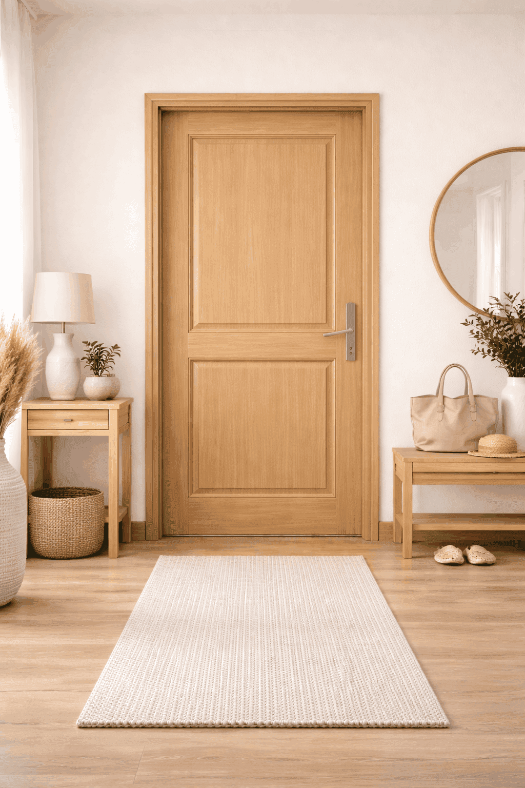
1. Classic Teak Brown
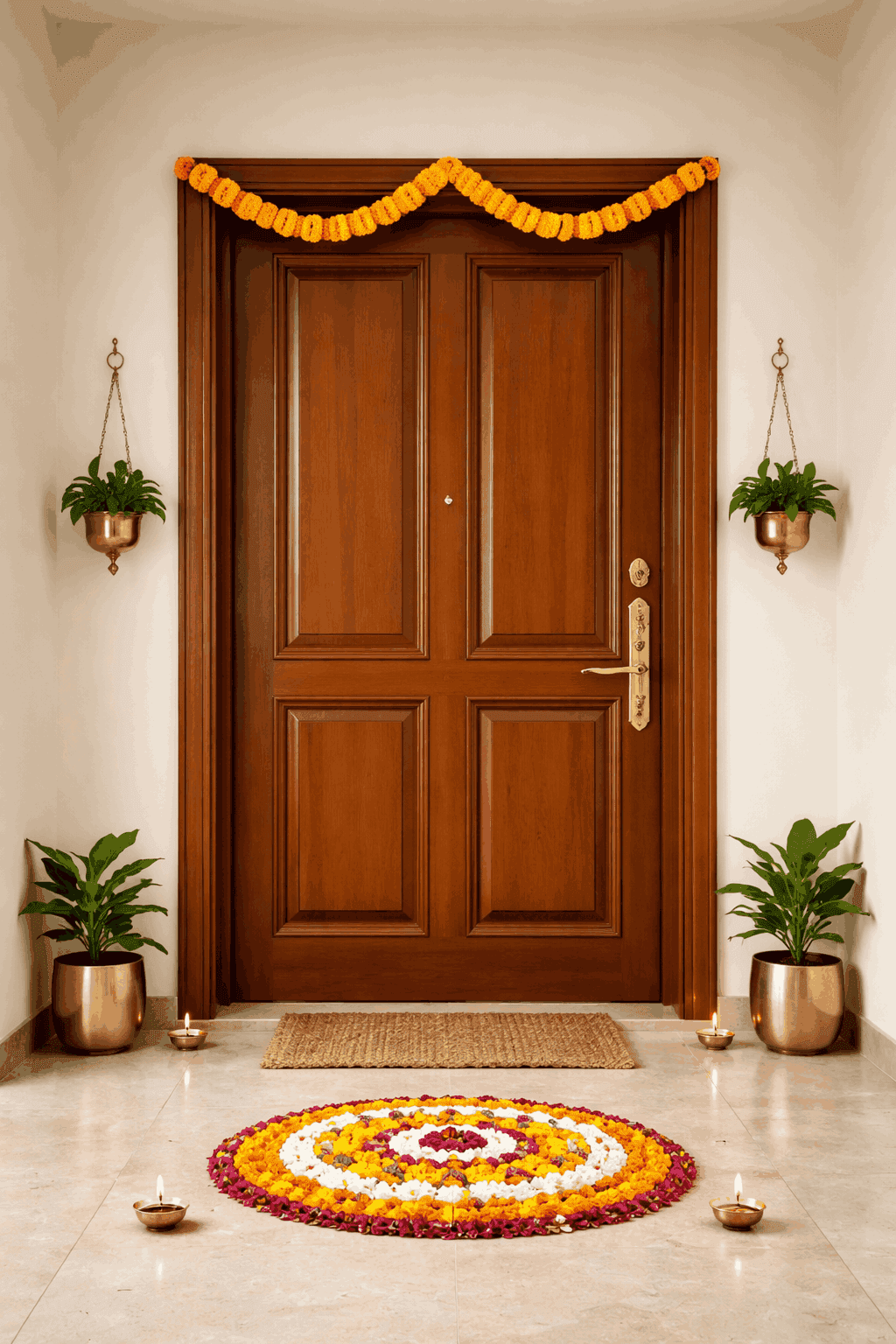
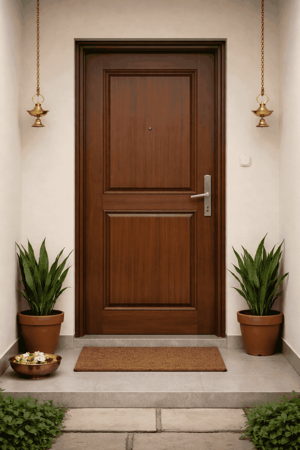
Teak brown is a timeless choice that has long been associated with Indian homes. It brings warmth, familiarity, and a sense of permanence to interiors. This colour works beautifully with cream, beige, off-white, and soft pastel walls, making it versatile across both traditional and modern spaces. It is especially effective for main doors where a strong, welcoming presence is important.
2. Medium Walnut Brown
Walnut brown offers a slightly deeper and more contemporary alternative to teak. It adds sophistication without feeling heavy and pairs well with neutral colour palettes such as greys, warm whites, and muted earthy tones. This shade suits modern apartments and homes that prefer understated elegance over visual boldness.
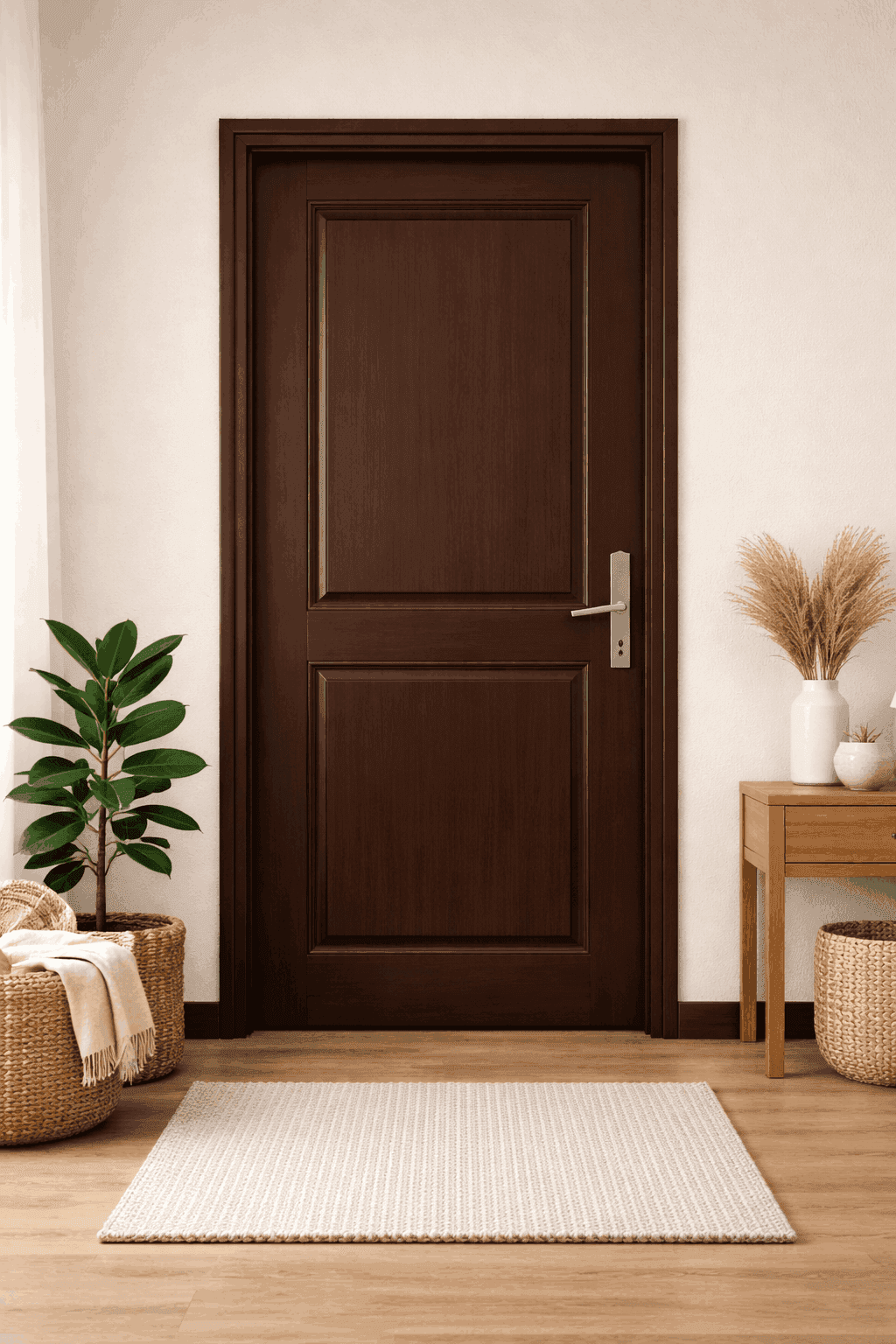
3. Dark Chocolate Brown
Dark chocolate brown creates a grounded and luxurious feel. It works best in homes with good natural or layered lighting, where the richness of the colour can be appreciated without making the space feel enclosed. This shade complements light walls and minimal interiors particularly well.
4. Espresso Brown
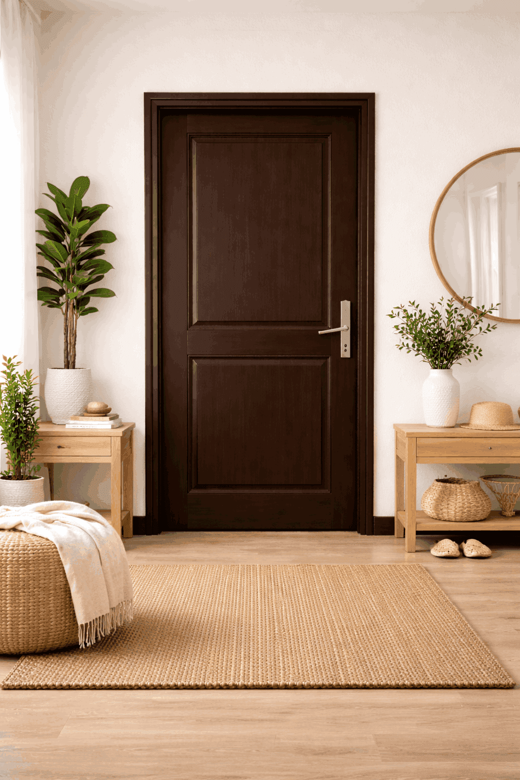
Espresso brown is deep, refined, and dramatic. It adds visual weight to a space and is best used where doors are meant to feel substantial and architectural. When paired with light flooring and neutral walls, this colour creates a striking yet controlled contrast.
Light & Neutral Wood Tones
5. Natural Light Wood
Natural light wood tones help interiors feel open, relaxed, and welcoming. These shades are particularly suitable for compact homes or rooms with limited daylight, as they reflect light rather than absorb it. They blend effortlessly with minimal, Scandinavian, and modern interior styles.
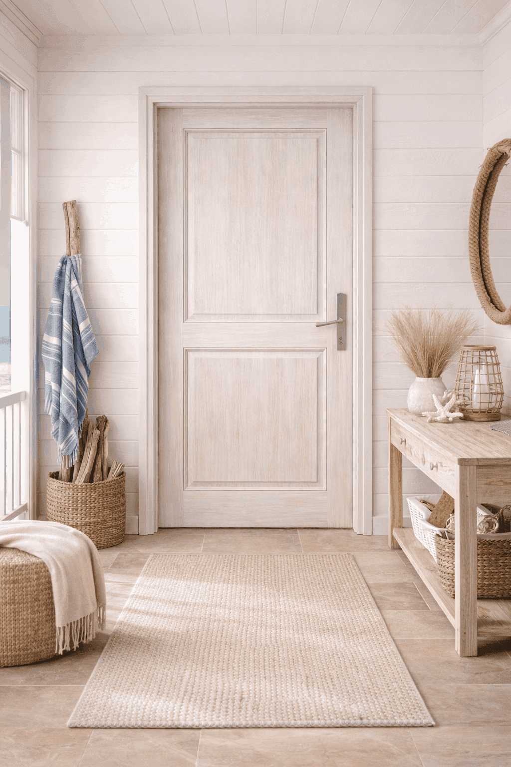
6. White Washed Wood
White washed wood softens the natural grain of the door while maintaining brightness. It creates a calm and breezy look that works well in contemporary and coastal-inspired interiors. This colour is ideal for internal doors where subtlety and lightness are preferred.
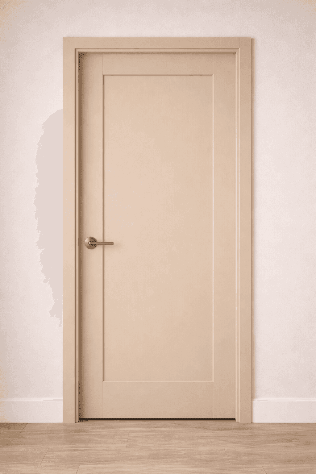
7. Beige Wood Tone
Beige wood tones offer a warm yet neutral option for homeowners who want something softer than brown. This shade integrates seamlessly with warm whites, creams, and earthy palettes. It works well across multiple rooms, helping maintain a consistent visual flow.
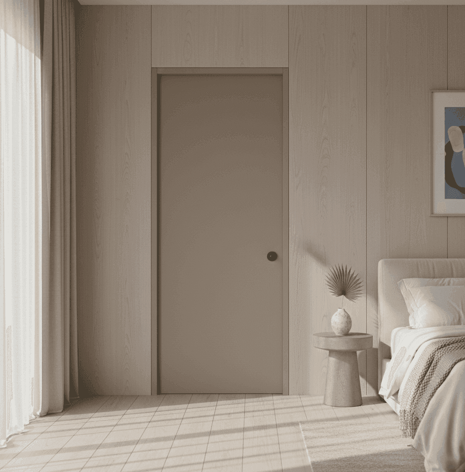
8. Taupe Wood Finish
Taupe sits comfortably between grey and brown, making it an extremely adaptable colour. It brings quiet sophistication to interiors and works well in homes that use layered neutrals. This shade is ideal when the door is meant to blend in rather than stand out.
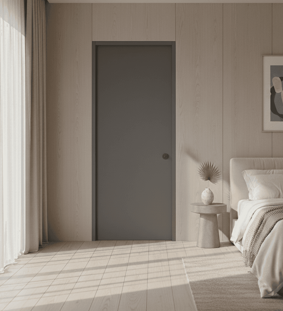
Grey & Monochrome Shades
9. Light Grey Wood
Light grey wooden doors feel modern and airy. They suit urban apartments and homes with a neutral or monochromatic palette. This shade works particularly well in spaces that aim for a clean, contemporary look without stark contrast.
10. Mid Grey Wooden Door
Mid grey provides more depth than lighter greys while remaining versatile. It pairs well with white, charcoal, and muted accent colours. This option is ideal for homeowners who want a modern feel without committing to darker tones.
11. Charcoal Grey
Charcoal grey adds drama while still feeling restrained. It offers an excellent alternative to black, providing visual weight without overpowering the space. This colour works best in well-lit interiors with simple wall finishes.
12. Matte Black Wood
Matte black doors make a strong architectural statement. They are best used selectively, often in modern or minimalist homes, where clean lines and uncluttered spaces allow the colour to stand out. Proper lighting is key to keeping this choice refined rather than heavy.
Blues & Teal Tones
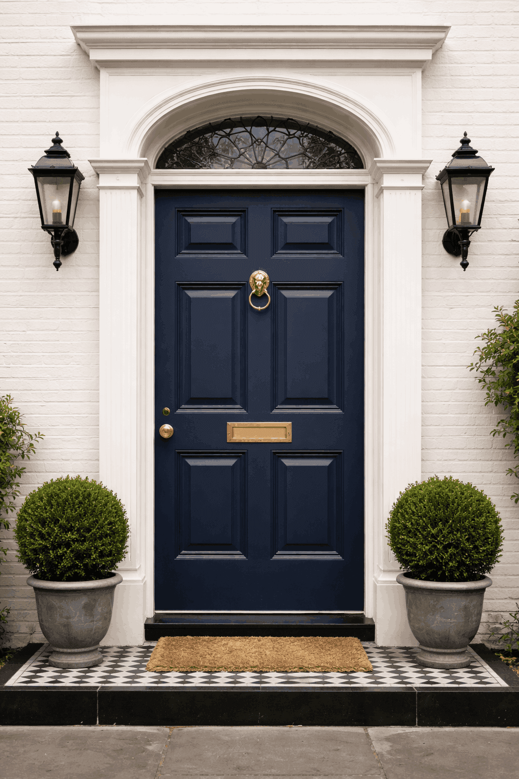
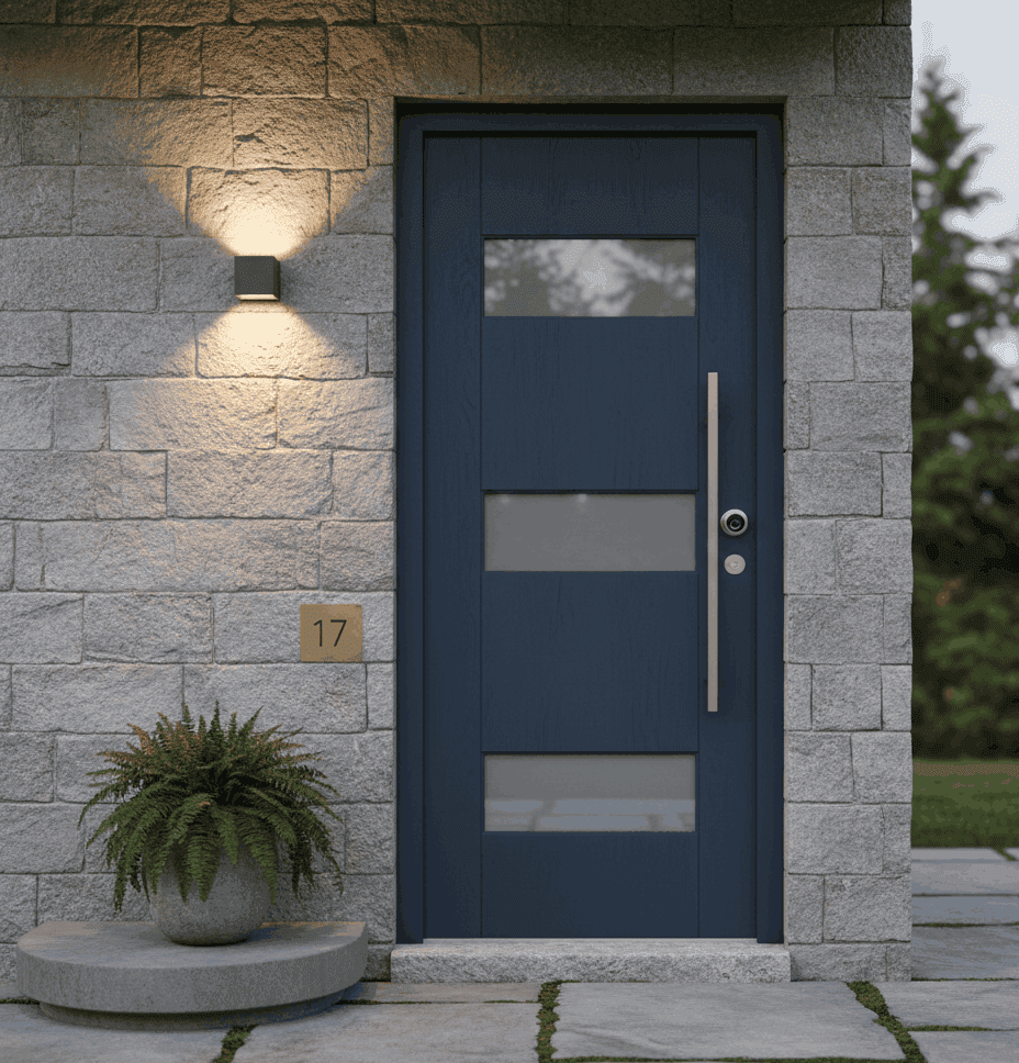
13. Navy Blue Wooden Door
Navy blue is classic, elegant, and surprisingly versatile. It works well in formal spaces and pairs beautifully with white, beige, and grey interiors. This colour adds depth without the intensity of brighter blues.
14. Slate Blue
Slate blue is muted and calming, making it ideal for private spaces like bedrooms and studies. It introduces colour in a subtle way and works well with neutral walls and natural textures.
15. Dusty Blue
Dusty blue has a soft, slightly grey undertone that keeps it from feeling overpowering. It suits modern Indian homes that want a hint of colour while maintaining a calm and cohesive aesthetic.
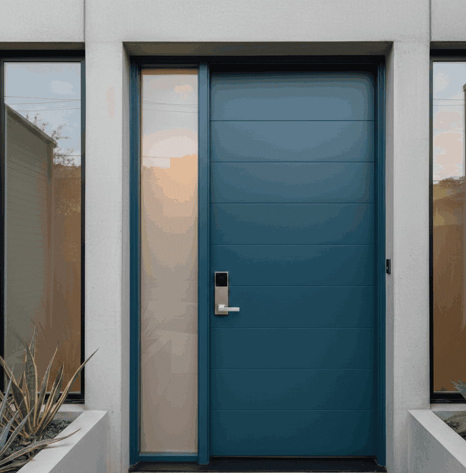
16. Teal Wooden Door
Teal is rich and sophisticated, sitting between blue and green. It works best when balanced with neutral surroundings and controlled lighting. This colour is ideal for accent doors where a touch of depth and individuality is desired.
Greens & Earthy Colours
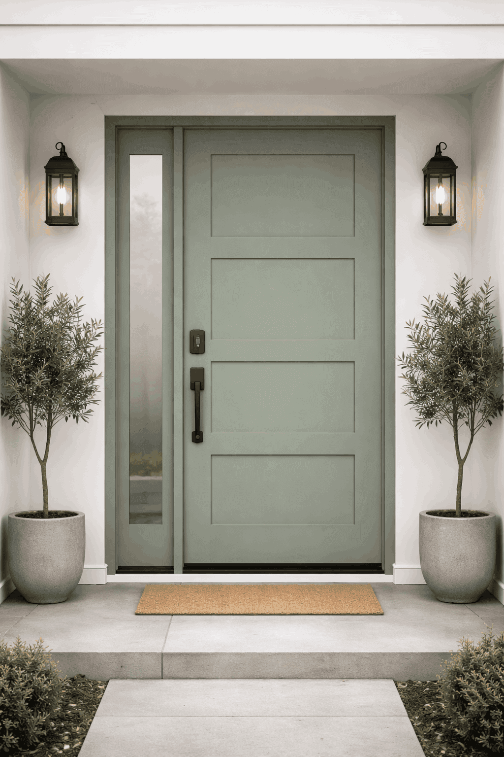
17. Sage Green
Sage green is light, soothing, and contemporary. It pairs well with white, beige, and natural wood elements. This shade is well suited for homes that prioritise calm, wellness-inspired interiors.
18. Olive Green
Olive green feels grounded and earthy, making it a natural fit for Indian homes. It works particularly well with warm neutrals and textured finishes, adding depth without appearing bold.
19. Deep Forest Green
Deep forest green is luxurious and dramatic. It is best used in formal or statement spaces where the door is meant to stand out. Balanced lighting and neutral walls help keep this shade elegant.
Warm Accent Colours
20. Mustard Yellow
Mustard yellow adds warmth and personality when used thoughtfully. On wooden doors, it works best as an accent colour rather than a dominant feature. This shade suits creative spaces and homes that embrace subtle colour play.
21. Soft Ochre
Soft ochre is a muted, earthy alternative to yellow. It feels warm without being bright and pairs well with natural textures and neutral palettes. This colour adds character while remaining understated.
Rich Statement Shades
22. Burgundy
Burgundy is deep, dramatic, and refined. It works best in homes with classic detailing or heritage-inspired interiors, where richer colours feel intentional. This shade is most effective when used selectively as a statement.
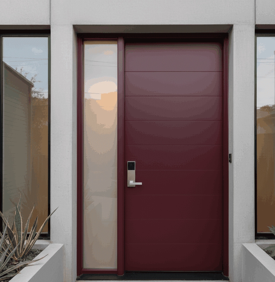
23. Wine Red
Wine red brings warmth and depth while remaining controlled. When paired with neutral surroundings, it adds richness without overwhelming the space. This colour suits formal areas where a slightly bolder palette is already present.
24. Rust or Terracotta Tone
Rust and terracotta tones feel organic and rooted in Indian aesthetics. They introduce warmth and texture, working especially well with earthy interiors, natural materials, and soft lighting.
Contemporary Mix
25. Dual Tone Wooden Door
Dual tone doors combine two complementary shades to add visual interest. This approach works well in contemporary homes where doors are treated as part of the overall design language rather than a background element.
How to Choose the Right Door Colour Room by Room
While it is tempting to pick one colour and apply it across the house, doors serve different visual roles depending on where they are placed. Thinking room by room helps ensure that each door supports the function and mood of the space without breaking overall harmony.
Main Door
The main door sets the first impression of the home. Rich, grounded colours like teak brown, walnut, espresso, navy, forest green, or burgundy work well here because they convey solidity and presence. These colours feel intentional and welcoming when balanced with lighter interior palettes.
Living and Dining Areas
Doors opening into shared spaces should blend seamlessly with walls, flooring, and furniture. Neutral wood tones, taupe, beige, mid-grey, or muted blues are ideal choices. They allow the focus to remain on the interior styling rather than the door itself.
Bedrooms
Bedroom doors benefit from softer, calming shades. Light wood, sage green, dusty blue, slate blue, or soft greys create a relaxed transition into private spaces. These colours support restfulness without feeling bland.
Study or Home Office
A study door can handle slightly deeper or more character-driven colours like olive green, charcoal grey, navy, or walnut. These tones add seriousness and focus without becoming visually heavy.
Utility and Secondary Doors
For utility areas, store rooms, or secondary passages, understated colours work best. Beige wood, light grey, white-washed finishes, or neutral browns keep these areas visually quiet and cohesive.
Using Different Shades of the Same Colour Family
One of the most effective design strategies in homes with multiple doors is to work within a single colour family while varying the shade. This creates visual continuity without monotony.
For example:
A main door in deep walnut
Living area doors in mid walnut
Bedroom doors in lighter walnut or taupe
Similarly, blue tones can move from navy to slate to dusty blue across different spaces. This layered approach feels intentional and sophisticated, especially in larger homes or apartments with long corridors.
Using related shades also helps avoid visual clutter, which is a common issue in Indian homes with many visible doors.
Common Door Colour Mistakes to Avoid
Even well-designed homes can feel disjointed if door colours are chosen without considering the bigger picture. Some common mistakes include:
Using too many unrelated colours across doors
Choosing very dark shades in poorly lit spaces
Picking bold colours without balancing walls and flooring
Treating doors as isolated elements rather than part of the interior pal
A cohesive approach always delivers a more premium result than multiple strong statements competing for attention.
How Natural Lighting Should Influence Door Colour Selection
Natural light plays a major role in how door colours are perceived inside a home. The same colour can look warm, flat, or heavy depending on the amount and direction of light it receives. Factoring this in helps avoid choices that look good in isolation but feel wrong once installed.
Homes With Abundant Natural Light
If your home receives plenty of daylight, you have more flexibility with deeper and richer door colours. Shades like walnut, espresso brown, navy, forest green, burgundy, and charcoal grey tend to look balanced in bright spaces because the light prevents them from feeling too heavy.
In such homes, darker door colours can add depth and contrast without making interiors feel closed in.
Homes With Moderate Natural Light
For homes with a mix of natural and artificial lighting, mid-tone colours work best. Teak brown, taupe, mid grey, slate blue, olive green, and honey-toned woods maintain warmth while still reflecting enough light to keep spaces comfortable.
These shades adapt well throughout the day and remain visually consistent from morning to evening.
Homes With Limited Natural Light
In spaces where daylight is minimal, lighter door colours help keep interiors feeling open. Natural light wood, white-washed finishes, beige tones, dusty blue, sage green, and light grey prevent the space from feeling enclosed or heavy.
Avoid very dark or saturated colours in such areas unless the door is supported by strong artificial lighting.
Direction of Light Also Matters
Doors near east-facing windows often receive soft morning light, which enhances warm tones. West-facing light is harsher and can deepen colours by evening. North-facing rooms benefit from warmer door shades, while south-facing rooms can comfortably handle cooler tones.
Understanding how light moves through your home helps ensure the chosen door colour looks good at all times, not just at one moment of the day.
Final Thoughts on Choosing Colours for Doors
Door colours are often subtle decisions, but they have a lasting impact on how a home feels. Whether you prefer classic browns, calm neutrals, layered greys, or muted colours like teal, navy, or sage, the best colors for doors are those that align with your overall interior story.
Thoughtful colour selection brings balance, flow, and quiet confidence to a home. When done right, doors stop being just functional elements and become an integral part of the design language.
At Tint Tone and Shade, we guide homeowners through these decisions with a focus on longevity, visual harmony, and real-life usability, ensuring interiors feel considered rather than overdesigned.
Frequently Asked Questions on Wooden Door Colours
Why are door colours important in interior design?
Door colours influence how calm, cohesive, and balanced a home feels. Since doors appear repeatedly across rooms and corridors, their colour choices strongly affect visual flow and continuity.
Should all doors in a house be the same colour?
Not necessarily. Using different shades within the same colour family often creates a more refined result than using one identical colour everywhere or many unrelated colours.
Which door colours work best for Indian homes?
Indian homes respond well to warm browns, earthy tones, layered neutrals, muted blues and greens, and terracotta-inspired shades. These colours age gracefully and suit a wide range of interior styles.
How do I choose a door colour for the main door?
Main doors benefit from deeper, grounded colours that feel welcoming and substantial. Rich browns, deep blues, forest greens, and burgundy tones work well when balanced with lighter interiors.
What door colours are suitable for bedrooms?
Bedrooms work best with softer, calming shades such as light wood tones, sage green, dusty blue, slate blue, or soft greys. These colours support rest and relaxation.
Can darker door colours be used in apartments?
Yes, but only when supported by adequate natural or artificial lighting. In well-lit homes, darker door colours add depth and sophistication without making spaces feel heavy.
How does natural light affect door colour choice?
Natural light changes how colours appear throughout the day. Bright homes can handle deeper shades, while homes with limited daylight benefit from lighter, reflective door colours.
Should door colours match wall colours exactly?
Door colours do not need to match walls exactly. Slight contrast or tonal variation often looks more intentional and prevents interiors from feeling flat.
Are bold door colours suitable for all rooms?
Bold colours work best when used selectively. They are more effective for main doors, studies, or feature doors rather than for every internal door.
What are common mistakes to avoid when choosing door colours?
Common mistakes include using too many unrelated colours, choosing very dark shades in poorly lit areas, and selecting door colours without considering walls, flooring, and furniture.
How do designers maintain consistency when using multiple door colours?
Designers usually work within one or two colour families and vary the depth or tone, ensuring consistency while avoiding monotony.
Similar Topic