20 Best Kitchen Wall Colour Combinations Ideas
How to Guides


Choosing the right colour for kitchen walls can feel like a difficult decision. You want a shade that looks beautiful but also handles the unique demands of an Indian kitchen. It must resist stains, cope with heat, and feel fresh even in a busy space.
Many Indian kitchens struggle with a lack of natural light or feel overly cramped. The wrong paint choice can make these problems feel much worse, leaving the room feeling dark and uninviting. A well-chosen palette, however, can completely transform this vital heart of your home.
In this guide, we will explore twenty brilliant kitchen colour combinations. These ideas will help you create a space that is both highly functional and beautifully reflective of your personal taste. You can discover the perfect colour for kitchen wall designs that suit your lifestyle.
Quick look:
Light colours like white and sky blue make small, windowless kitchens feel larger and brighter by reflecting more light.
Mid-tone shades like sage green or ocean blue are practical for Indian kitchens as they hide stains and splatters better than very light or dark colours.
Warm undertones in whites and neutrals prevent a sterile feel and create a welcoming glow under artificial lighting, common in Indian homes.
Use bold colours like red or terracotta as accents on a single wall or island to add energy without overwhelming a compact space.
Always pair deep cabinet colours like navy or charcoal with ample artificial or natural light to keep the kitchen from feeling dark and cramped.
The finish is as crucial as the colour; satin or semi-gloss paints are easier to wipe clean than flat matte finishes.
The Importance Of Choosing The Right Colour For Kitchen Walls
Your kitchen wall colour does much more than just decorate the room. It directly influences the atmosphere, perceived space, and daily functionality of your cooking area.
A thoughtful choice can solve common problems, making your kitchen a more pleasant and efficient place for meal preparation and family time. Here are the key reasons to carefully consider your kitchen’s colour scheme:
Alters The Perception Of Space
Light colours can make a small kitchen feel more open and airy. They reflect light effectively, pushing the walls visually further apart. This is a crucial consideration for many compact Indian kitchen layouts.
Enhances The Quality Of Light
The right colour can soften harsh artificial lighting or brighten a dim room. Warm, light tones help create a gentle, inviting glow. This makes your kitchen feel more comfortable during early mornings and late evenings.
Supports Easy Maintenance
Kitchens deal with grease, steam, and food splatters. Durable paints in mid-tone shades are practical for Indian cooking. They are easier to wipe down and keep looking clean with regular maintenance.
Sets The Emotional Tone
Colours influence your mood while you are cooking or dining. Calm hues can make meal preparation less stressful. Warmer, sociable colours help turn the kitchen into a welcoming family hub.
Also read: 16 Popular Two-Colour Combinations for Kitchen Laminates in 2025
Understanding these benefits makes selecting a specific palette much simpler. Let's now look at twenty distinct colour combinations that put these principles into practice.
20 Inspiring Kitchen Colour Combination Ideas
Let's explore specific colour palettes that work beautifully in Indian homes. Each combination addresses common issues like small spaces, low light, or the need for a practical yet stylish environment.
These ideas will make your kitchen feel larger, brighter, and perfectly suited to your lifestyle:
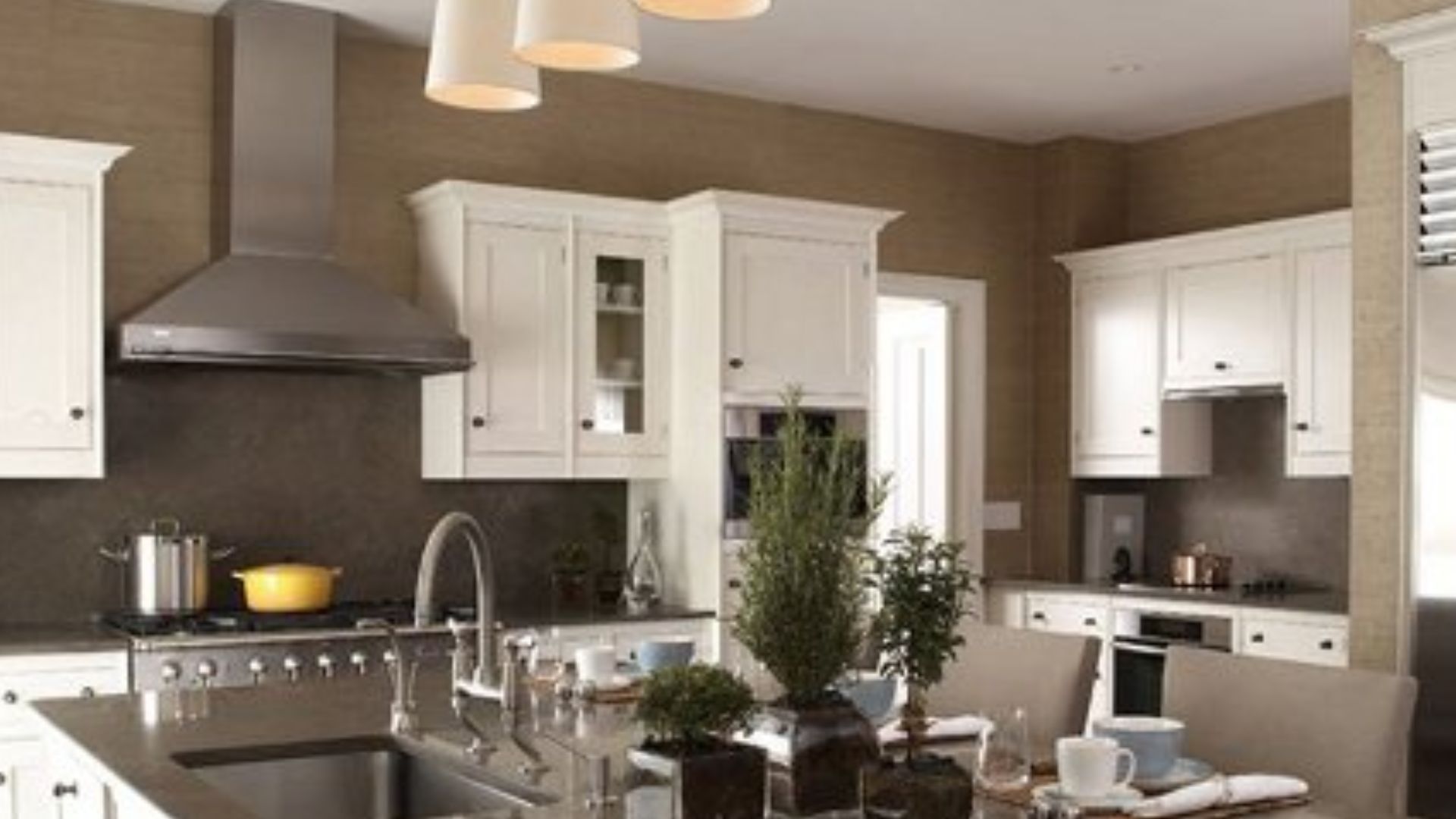
1. Classic White and Warm Wood
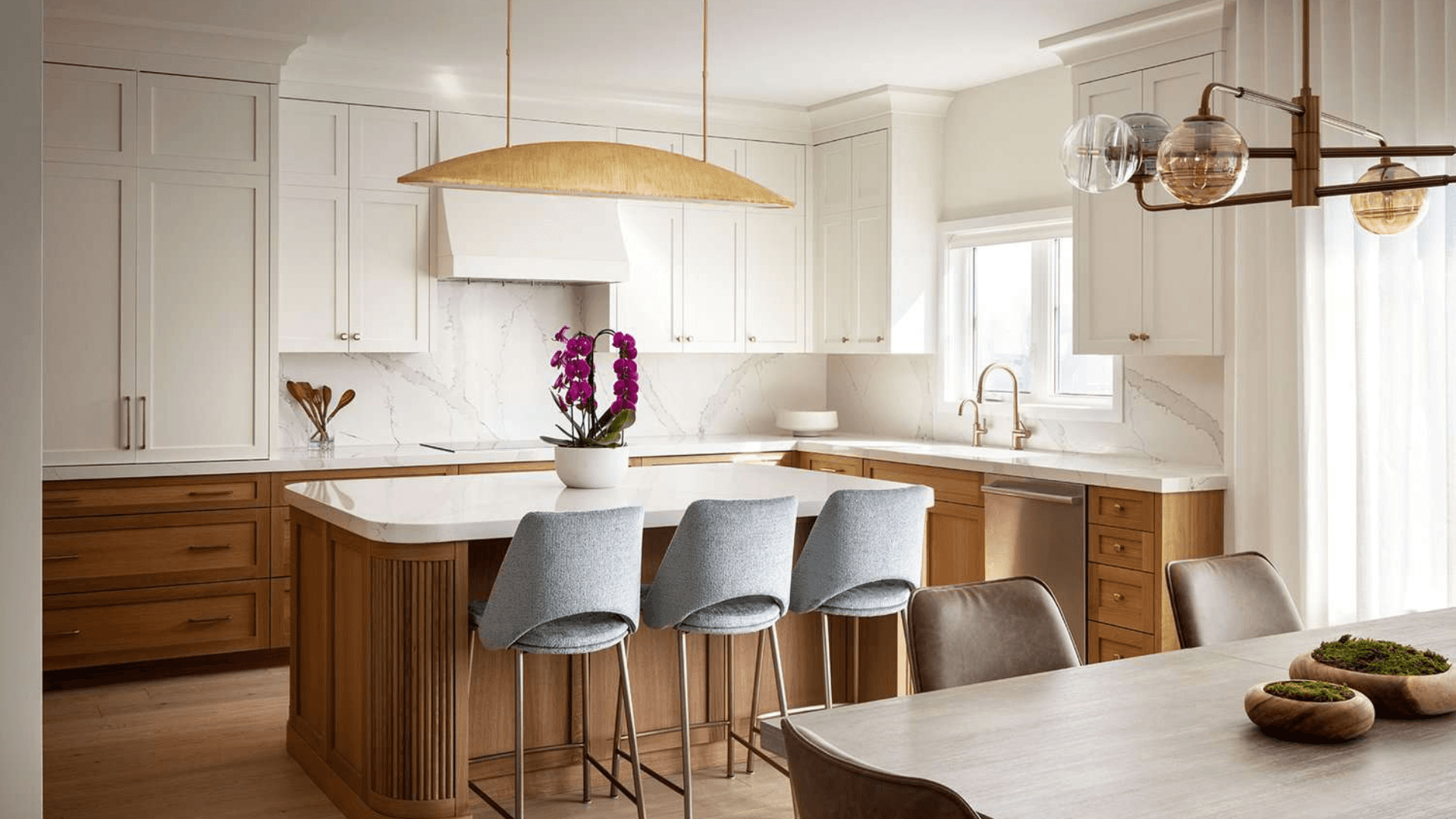
This timeless pairing uses crisp white cabinets and walls to maximise light. Introduce warm wood tones through your flooring or open shelving. The contrast creates a clean, airy, and naturally inviting atmosphere.
Pro Tip: Choose a white with a slight warm undertone to avoid a sterile hospital feel. This adds subtle warmth under both natural and artificial kitchen lighting.
What makes this combination great:
It makes small kitchens feel instantly more spacious and open.
The scheme provides a neutral backdrop that makes colourful utensils and tiles stand out.
It is incredibly versatile and pairs well with any other accent colour you introduce later.
2. Ocean Blue and Off-White
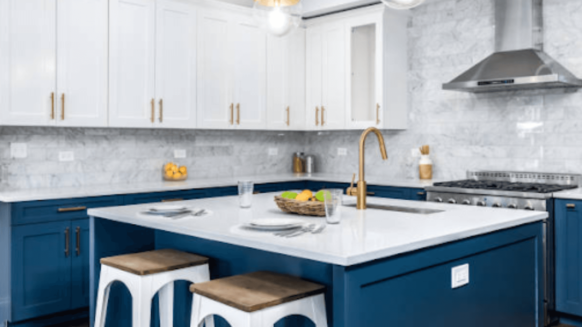
Paint a single accent wall in a serene ocean blue to add depth. Use off-white on the remaining walls and cabinets to maintain brightness. This combination brings a calm, refreshing feel to an often chaotic room.
Pro Tip: Use this combination in a kitchen that receives good morning sunlight. The sun will beautifully highlight the cool blue tones.
What makes this combination great:
The blue tone helps to create a calming and focused environment for cooking.
It effectively hides minor scuffs and stains better than a plain white wall.
It introduces colour without making the space feel dark or overwhelming.
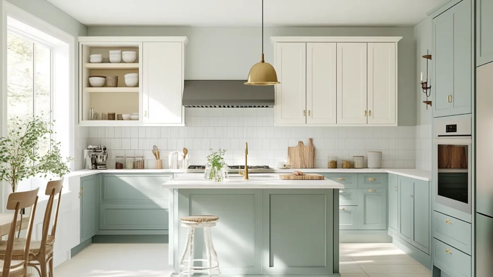
3. Sage Green and Cream
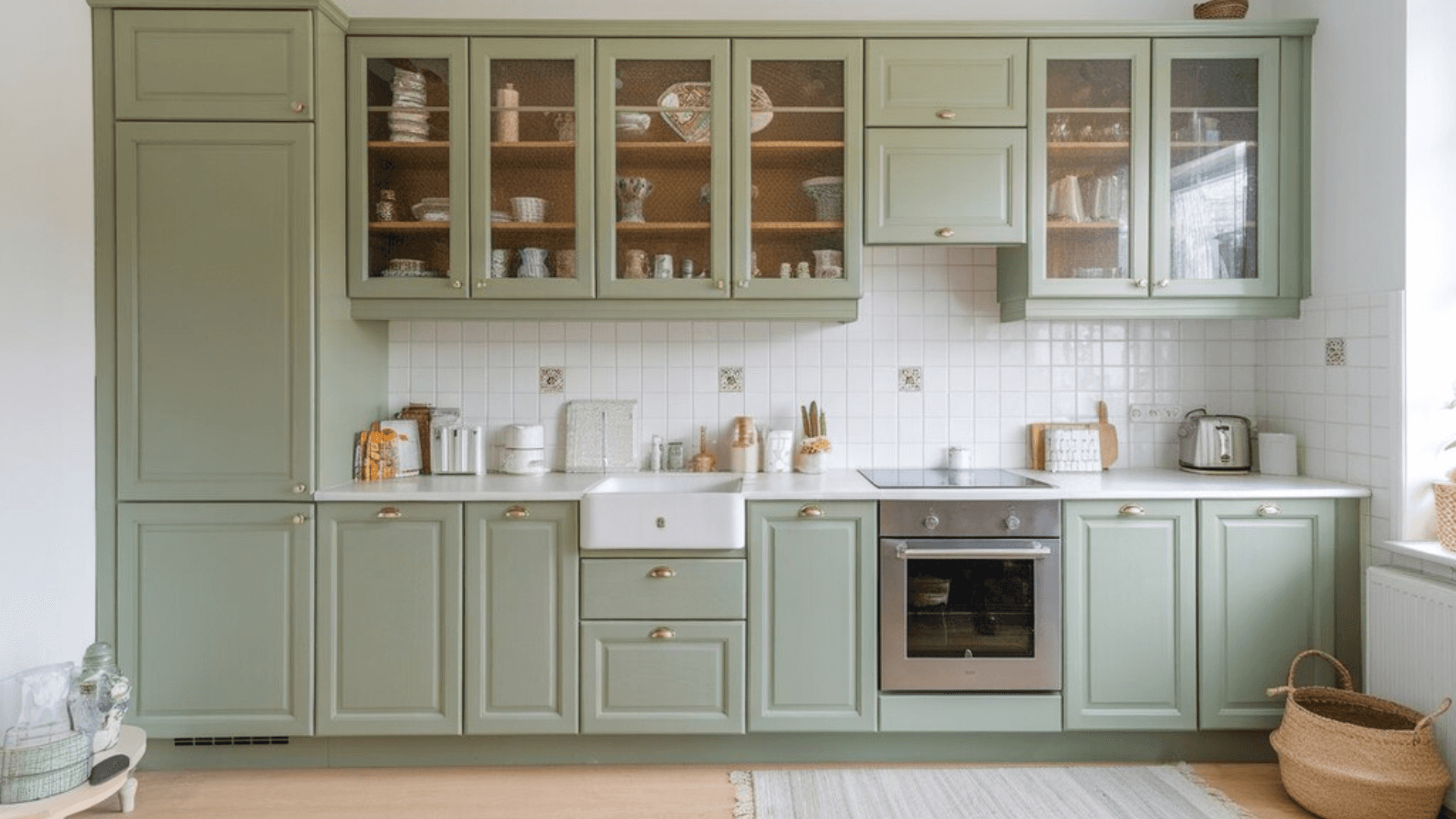
Sage green offers a soft, natural connection, perfect for creating a soothing kitchen environment. Pair it with warm cream cabinets and countertops for a harmonious look. This palette feels both fresh and comfortably familiar.
Pro Tip: Incorporate natural materials like a stone countertop or terracotta planters. These elements enhance the organic, earthy feel of the green.
What makes this combination great:
The green is soft on the eyes and reduces visual strain.
It creates a unique yet not overly bold statement.
It works well in both modern and traditional Indian home settings.
Feeling inspired but unsure which principle applies to your kitchen? Let our design experts analyse your space and lighting. Book a call now.
4. Charcoal Grey and Sunshine Yellow
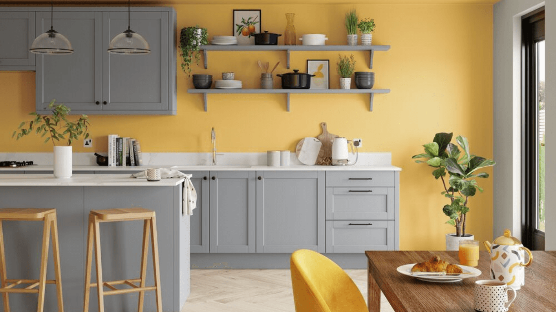
Use charcoal grey for lower cabinets to ground the space and hide stains. Add sunshine yellow as a wall colour or for upper cabinets to inject energy. This bold contrast is both modern and cheerful.
Pro Tip: Balance is key; use the yellow as an accent to prevent the space from feeling overwhelming.
What makes this combination great:
The grey provides a sophisticated, practical base.
The yellow brings warmth and brightness to the kitchen.
It is ideal for north-facing kitchens that need a vibrancy boost.
5. Terracotta and Warm White
Embrace an earthy, Indian aesthetic with rich terracotta on an accent wall. Combine it with plenty of warm white to keep the space from feeling too heavy. This scheme feels incredibly cosy and welcoming.
Pro Tip: Use terracotta in a matte finish to enhance its natural, earthy texture.
What makes this combination great:
It adds a distinctive, heritage-inspired character to your home.
The colour naturally promotes a warm and inviting atmosphere.
It pairs beautifully with brass or copper fixtures and accessories.
Also read: Total Kitchen Makeover: Before and After Remodelling Tips
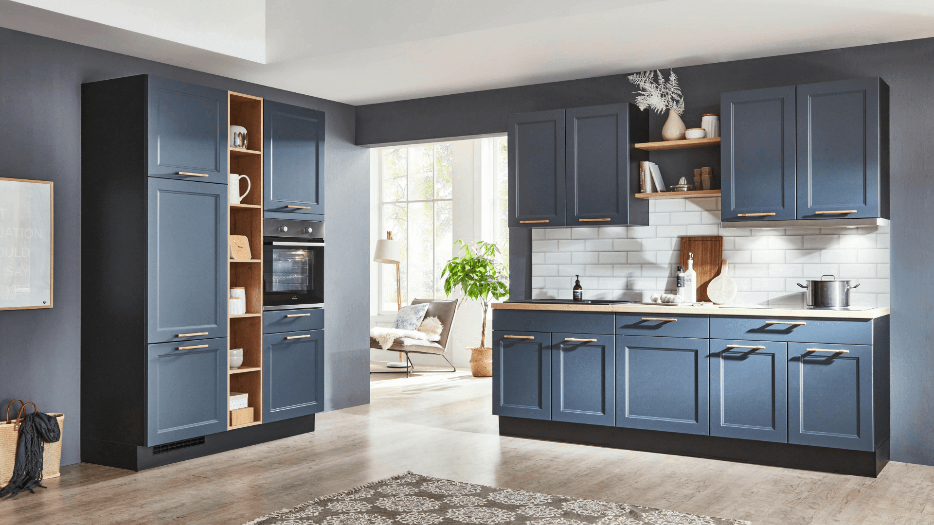
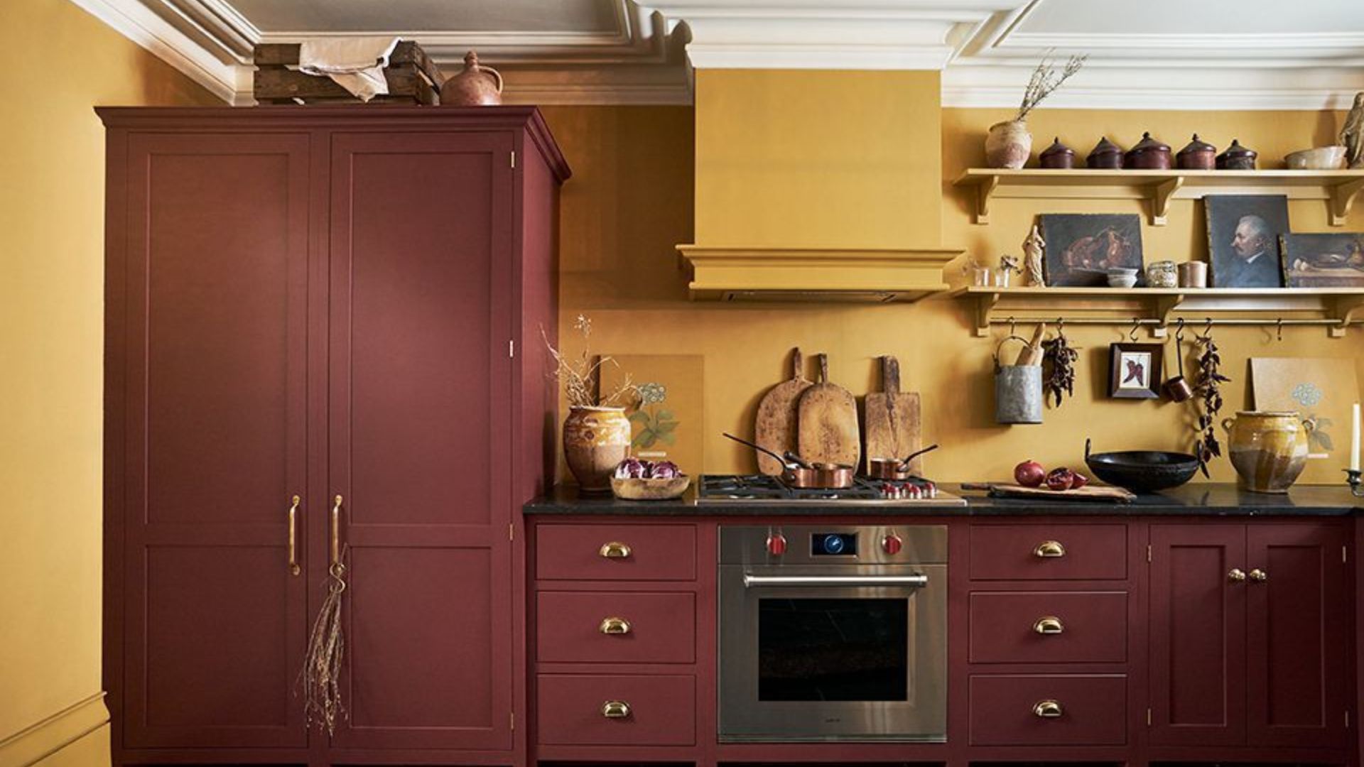
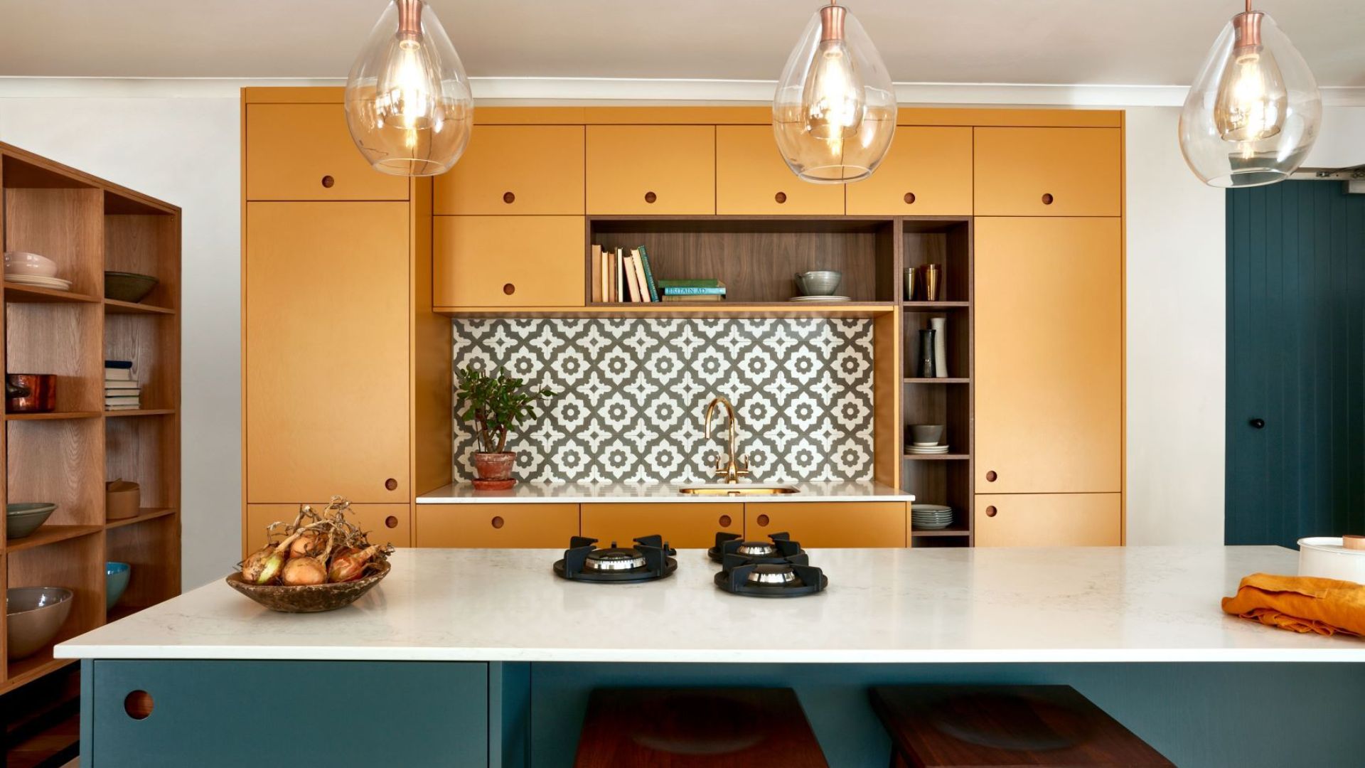
6. Navy Blue and Mustard Yellow
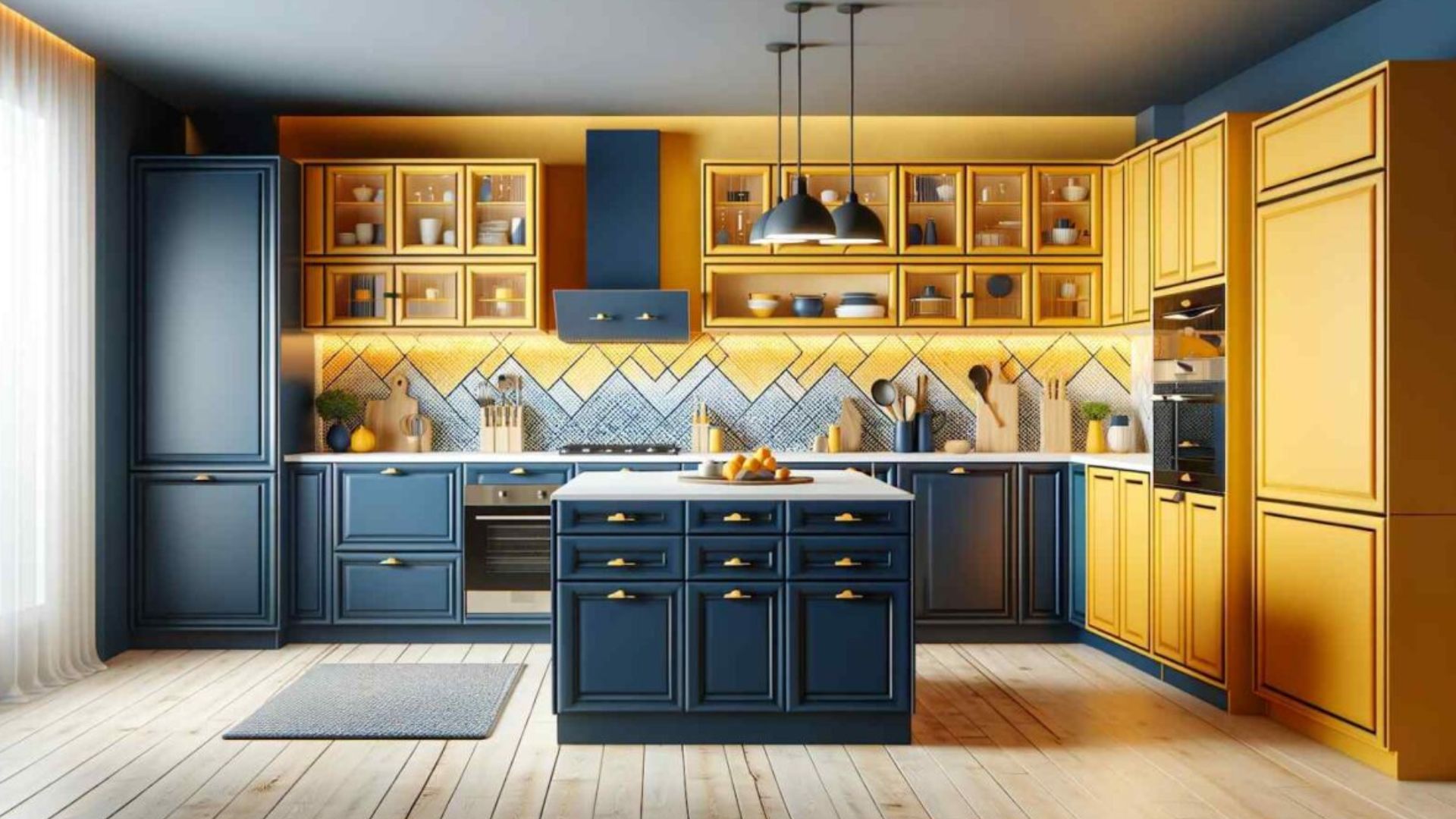
Create a sophisticated and dynamic look with deep navy blue cabinets. Use mustard yellow for the backsplash or kitchen accessories as a vibrant pop. This combination feels both traditional and contemporary.
Pro Tip: Ensure your kitchen has excellent artificial lighting to keep the navy from absorbing too much light.
What makes this combination great:
Navy blue is a dramatic yet timeless alternative to black.
The mustard yellow adds a luxurious and energetic contrast.
It creates a strong visual impact that is perfect for open-plan living.
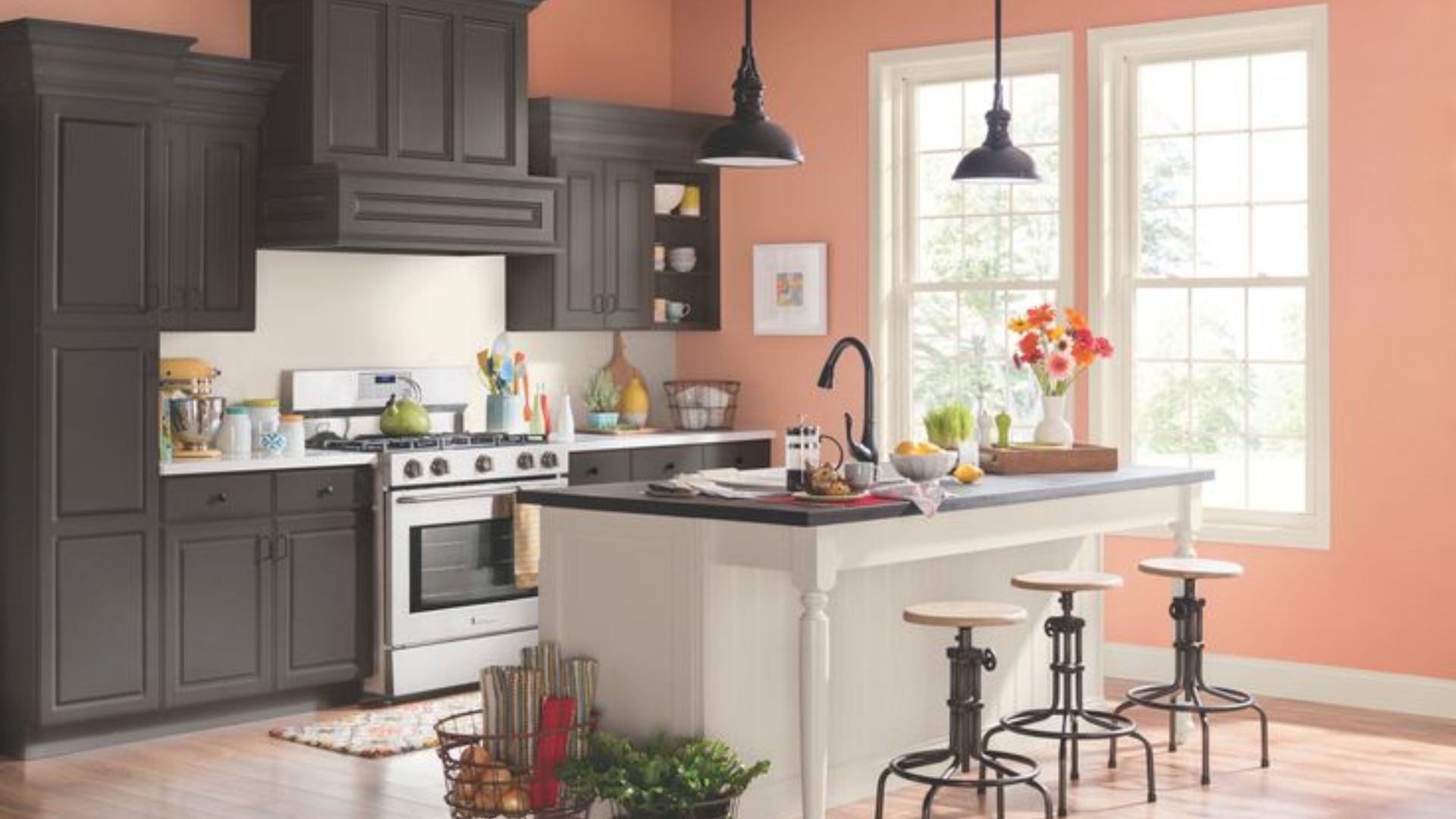
7. Soft Peach and Dove Grey
This gentle combination uses soft peach on walls to cast a flattering, warm glow. Dove grey on cabinets provides a cool, calming balance. The overall effect is soft, modern, and subtly feminine.
Pro Tip: This palette works exceptionally well in kitchens with plenty of natural light.
What makes this combination great:
It creates a soothing and stress-free environment.
The peach tone makes the space feel warm and inclusive.
It is a less common but highly appealing colour scheme.
8. Mint Green and Pure White
For a clean and crisp look, pair mint green walls with pure white cabinets and trim. This combination evokes a sense of freshness and hygiene, perfect for the kitchen. It feels light, bright, and revitalising.
Pro Tip: Add texture with a white subway tile backsplash to prevent a flat look.
What makes this combination great:
It is an excellent choice for small, windowless kitchens.
The green has a clean, almost retro charm that feels current.
It is easy to accessorise with other pastels or wood tones.
9. Lavender and Pale Oak
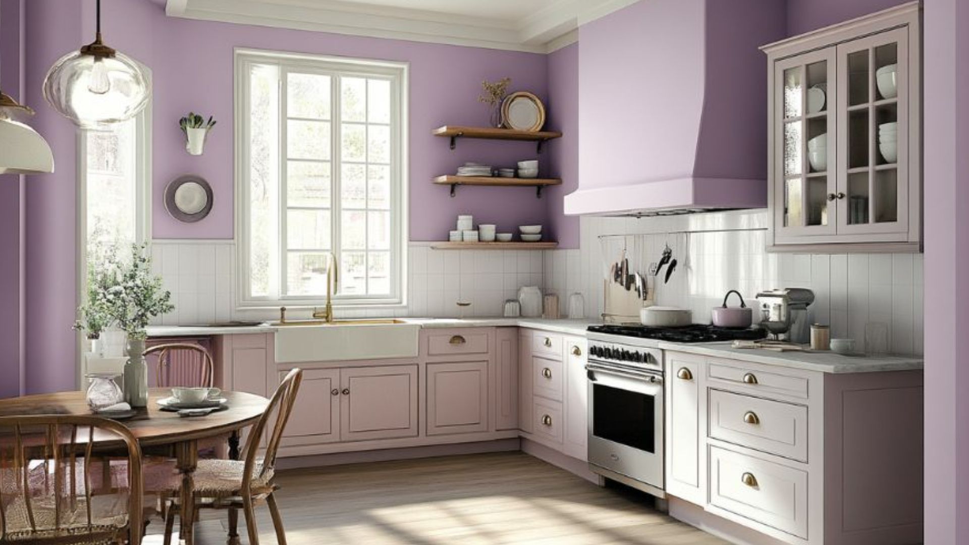
Introduce a touch of soft sophistication with muted lavender walls. Combine it with pale oak wood cabinets for a warm, natural counterpoint. This palette is calming and feels thoughtfully curated.
Pro Tip: Stick to a grey-based lavender to ensure it remains sophisticated and not childish.
What makes this combination great:
It offers a unique and personal alternative to common neutrals.
The combination is gentle on the eyes and promotes relaxation.
It creates a seamless flow into living areas with similar warm tones.
10. Bold Red and Neutral Beige
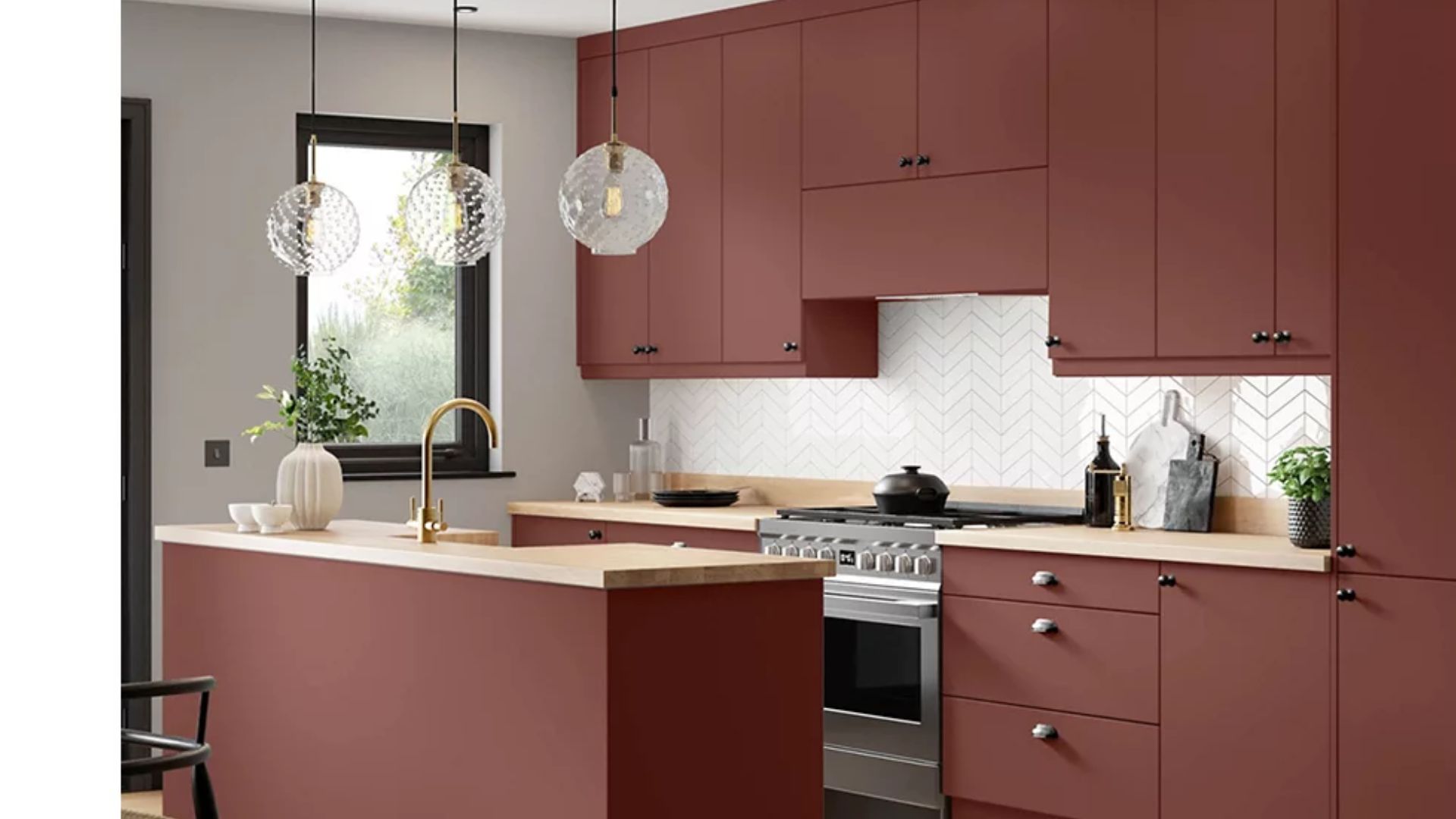
Inject passion and energy by using a bold red for a kitchen island or accent wall. Surround it with neutral beige on the other walls to temper the intensity. This creates a vibrant, social heart of the home.
Pro Tip: Use red in a well-lit area to allow its warmth to spread through the room.
What makes this combination great:
Red is known to stimulate appetite and conversation.
It adds a powerful dose of personality and cultural resonance.
The neutral beige prevents the scheme from becoming overstimulating.
This bold look requires careful planning to get right. Contact our experts to see if this palette works for your kitchen's layout and light.
11. Slate Blue and Rust
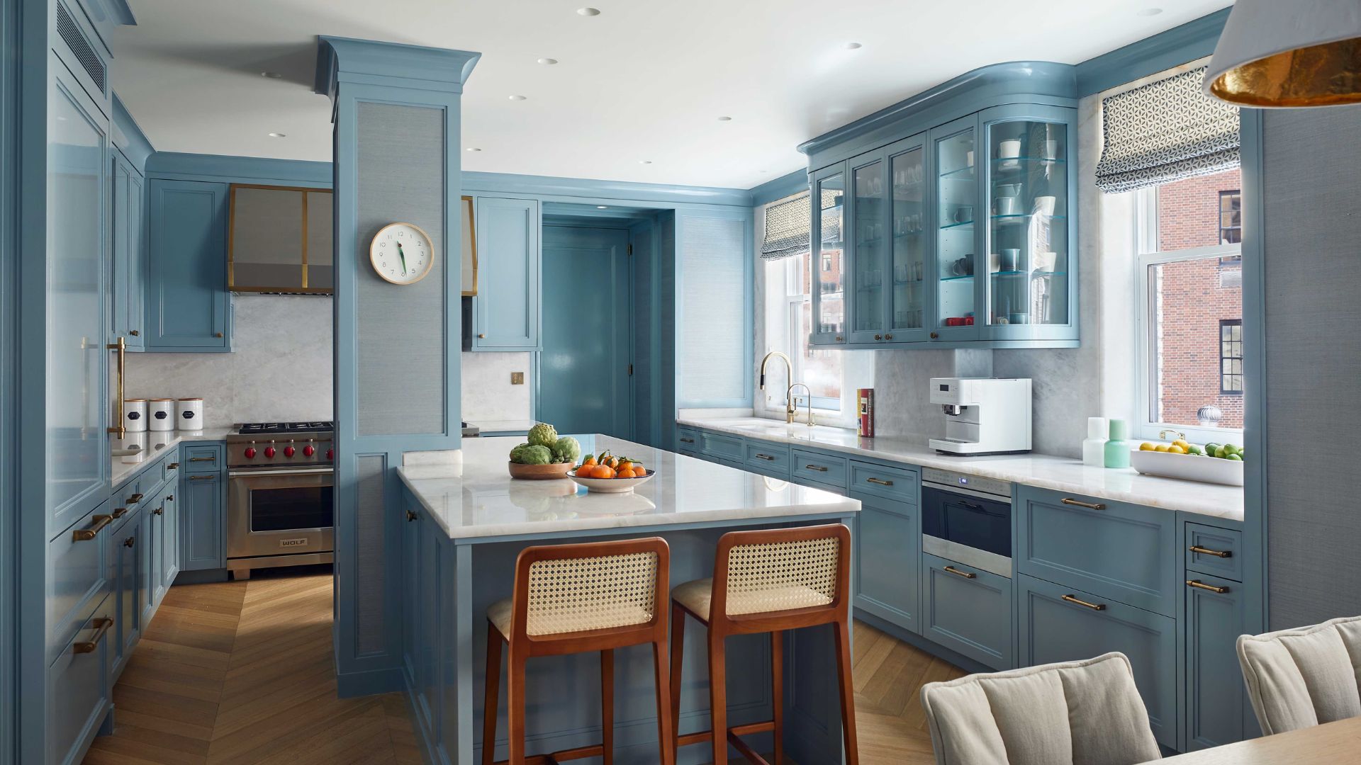
Create a rich, autumnal feel with slate blue on cabinets and a rust-coloured accent wall. This deep and complementary pairing feels both cosy and deeply stylish. It is ideal for creating a kitchen with character.
Pro Tip: Use brass or gold hardware to add a touch of luxury against these deep tones.
What makes this combination great:
It is a warm and welcoming alternative to cool grey schemes.
Both colours are excellent at concealing signs of daily wear and tear.
It creates a dramatic, intimate atmosphere in larger kitchens.
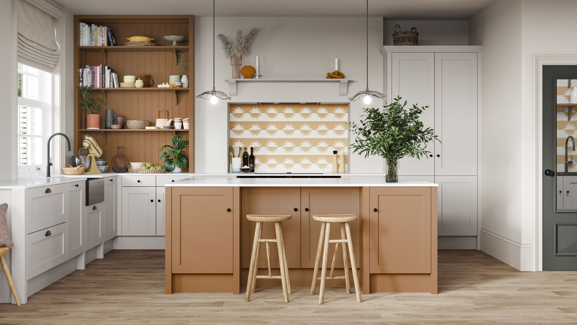
12. Butter Yellow and Chocolate Brown
This combination uses butter yellow on walls to brighten the space instantly. Chocolate brown on lower cabinets or flooring adds a grounded, stable feel. It feels like sunshine and rich soil.
Pro Tip: This scheme works best in kitchens with east-facing windows for morning sun.
What makes this combination great:
Yellow promotes feelings of happiness and optimism.
The brown adds a robust, earthy element that is very practical.
It is a classic, friendly palette that never goes out of style.
Also read: Best Kitchen Countertop Design Ideas for Your Home
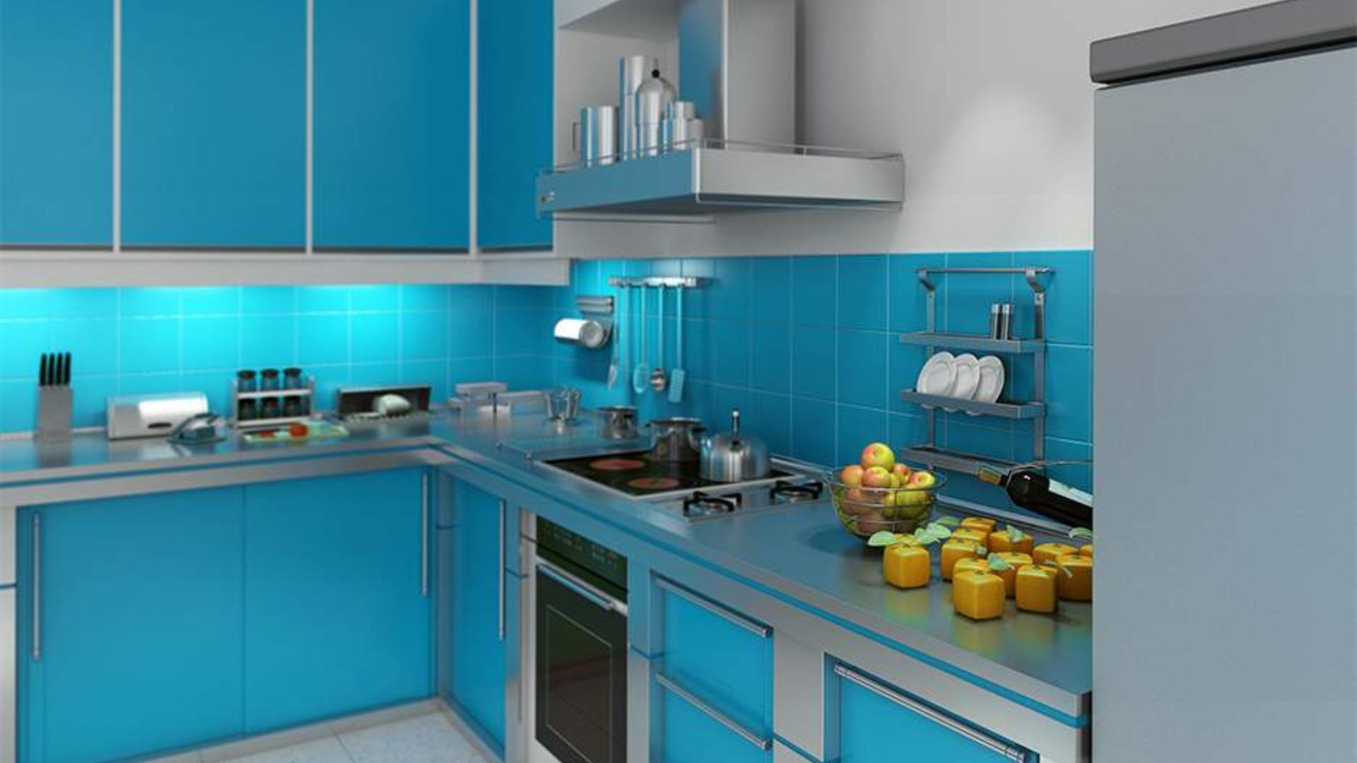
13. Teal and Burnt Orange
For a bold and energetic look, pair teal cabinets with burnt orange accessories or a tiled backsplash. This high-contrast scheme is full of personality and global inspiration. It is perfect for those who love colour.
Pro Tip: Introduce these colours through tiles and paint to keep the cabinets neutral if preferred.
What makes this combination great:
It creates a vibrant, creative, and stimulating environment.
The colours complement each other perfectly for a balanced look.
It reflects a confident and artistic personal style.
14. Light Grey and Pastel Pink
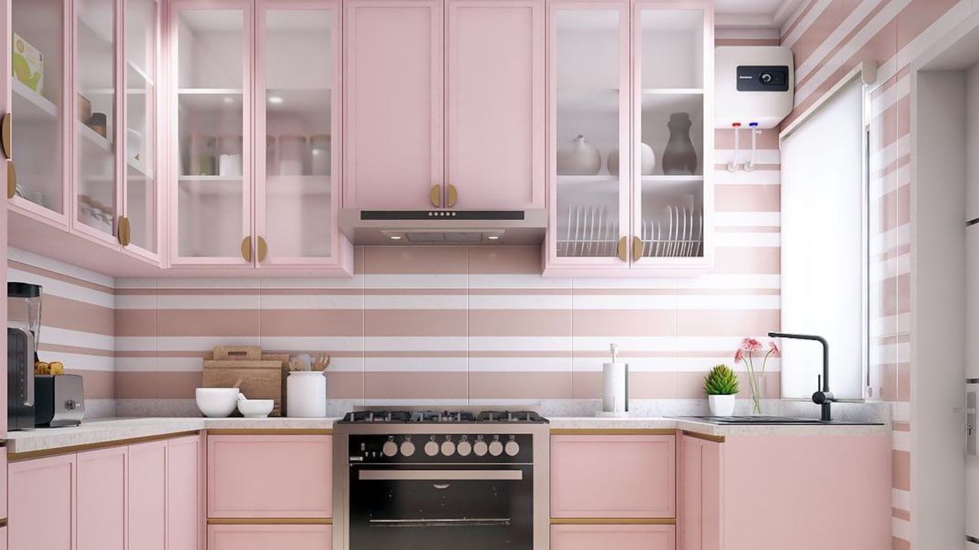
Achieve a modern, soft aesthetic by pairing light grey cabinets with a pastel pink wall. This combination is subtle, sophisticated, and feels both contemporary and gentle. It is unexpectedly charming.
Pro Tip: Keep the pink very pale and muted to maintain a grown-up, elegant feel.
What makes this combination great:
The grey provides a solid, modern foundation.
The pink adds a warm and subtly romantic glow to the room.
It is a very photogenic and stylish palette.
15. Olive Green and Natural Stone
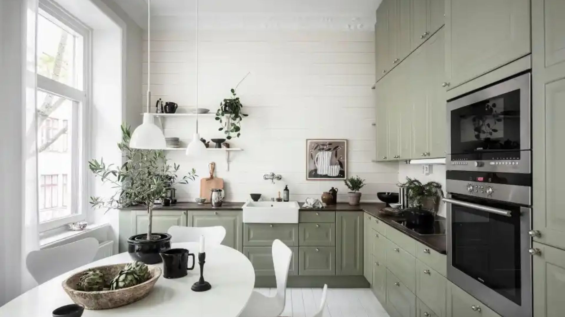
Create a connection to nature with deep olive green cabinets or walls. Pair it with countertops or tiles in natural stone colours like beige or grey. This scheme is organic and restful.
Pro Tip: Add woven baskets and wooden bowls to enhance the natural texture.
What makes this combination great:
Olive green is a rich, complex neutral that feels very current.
It is a forgiving colour that hides dust and smudges effectively.
It promotes a sense of tranquillity and well-being.
16. Violet and Silver Grey
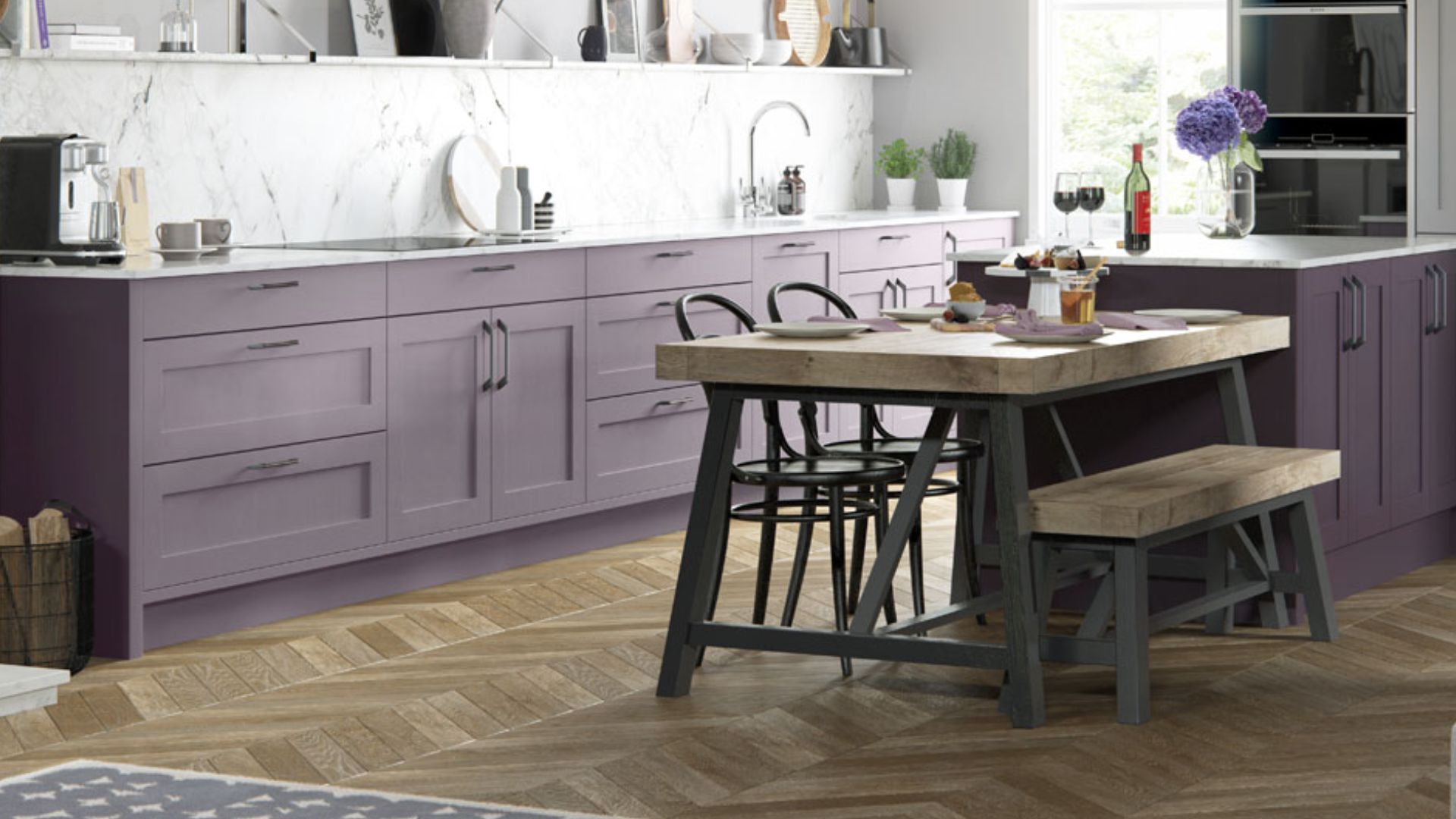
For a truly unique and luxurious kitchen, consider a deep violet for an accent wall. Combine it with sleek silver-grey cabinets and stainless steel appliances. This palette is dramatic and modern.
Pro Tip: Use this combination in a large, open kitchen to prevent it from feeling cramped.
What makes this combination great:
It creates a striking and memorable visual impact.
Violet is associated with creativity and luxury.
The cool grey balances the depth of the purple perfectly.
17. Sky Blue and White
This classic combination makes any kitchen feel fresh, clean, and spacious. Sky blue on the walls evokes a clear day, while bright white on trim and cabinets sharpens the look. It is perpetually cheerful.
Pro Tip: Use a glossy finish on the cabinets to reflect more light around the room.
What makes this combination great:
It is one of the most effective palettes for brightening a dark room.
The colour feels clean, hygienic, and endlessly calming.
It is easy to live with and always feels current.
18. Marigold and Deep Green
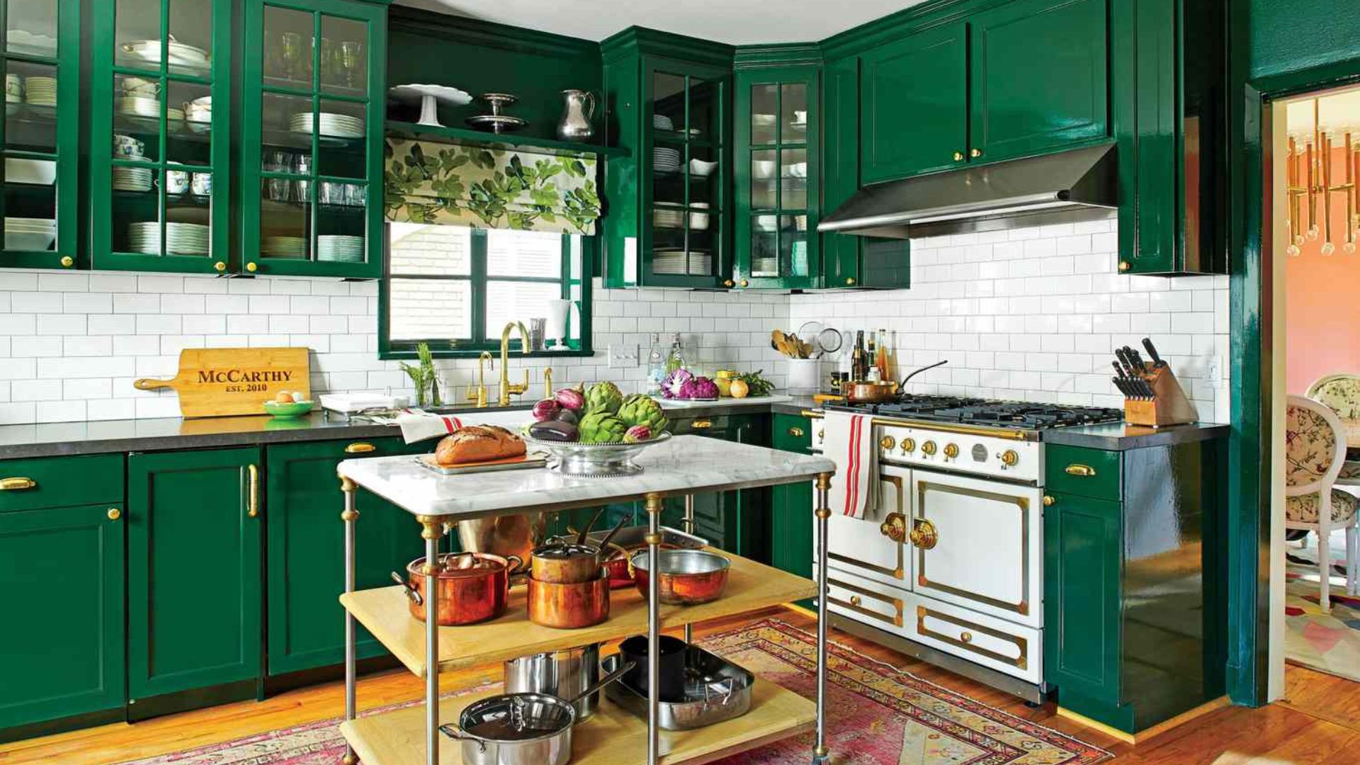
Capture the vibrancy of Indian festivals with a marigold yellow accent wall. Contrast it with deep green cabinets for a bold, nature-inspired look. This combination is full of life and energy.
Pro Tip: Use this in a kitchen with high ceilings to balance the intensity of the colours.
What makes this combination great:
It is a celebratory and culturally resonant colour pairing.
The contrast is visually stimulating and uplifting.
It creates a kitchen that is the undeniable centrepiece of your home.
Your dream kitchen is closer than you think. For a custom solution tailored to your home, our design team is just a call away. Book a demo now.
19. Taupe and Black
For a sleek, modern, and fail-safe look, pair warm taupe walls with black cabinets and hardware. This high-contrast scheme is sophisticated, powerful, and incredibly easy to execute.
Pro Tip: Add open wooden shelves to break up the black and add warmth.
What makes this combination great:
Taupe adds warmth where pure white might feel too cold.
Black cabinets are strikingly modern and very easy to maintain.
It is a timeless combination that exudes confidence.
Also read: Top Kitchen Decorating Ideas for Stylish Homes
20. Coral and Soft Grey
Coral brings a warm, peachy-pink energy that is both friendly and modern. Soft grey cabinets provide the perfect neutral backdrop to let the coral shine without overwhelming. This scheme feels fresh and contemporary.
Pro Tip: This colour works beautifully with both gold and silver metallic finishes.
What makes this combination great:
Coral is an inviting and sociable colour, perfect for a family kitchen.
The grey keeps the look grounded and sophisticated.
It is a warm and trendy yet highly livable palette.
With so many inspiring ideas, the next step is bringing your favourite to life. This is where a professional touch can ensure your vision is executed flawlessly.
Also read: 12 Low-Cost Simple Kitchen Design Ideas for Your Home
Your Kitchen Wall Colour Made Easy With Tint Tone and Shade
Tint Tone and Shade understands the obstacles you face while selecting a colour for the kitchen wall in your home. We help you identify palettes and finishes that create a welcoming kitchen and stand up to real daily cooking demands.
With deep experience in Indian home design, our experts solve space planning, lighting, and colour problems, all with a practical, creative approach.
Here’s why you should choose us:
100% Customised Colour Schemes: You get kitchen wall colours planned specifically for your layout, cooking style, and lighting.
High-Quality Paints and Finishes: We use premium products that stand up to stains, humidity, and daily cleaning, keeping your kitchen fresh.
Efficient, Stress-Free Service: Your kitchen makeover happens quickly, with attentive project management and guaranteed timelines.
Space Planning Experts: We ensure your chosen colour for the kitchen wall works beautifully with cabinetry, counters, and open shelving.
Tailored Design Consultations: Get expert advice as you decide on tones, contrast, and finishes that match your vision and cooking habits.
Your kitchen deserves careful planning and thoughtful colour choices that bring out its best day after day.
Final Thoughts
Choosing the right colour for kitchen walls makes a real difference to your daily comfort, lighting, and sense of space. You have seen inspiring combinations that brighten your kitchen, solve problems like stains or cramped layouts, and add personal character.
A well-chosen palette can transform meal times and the overall mood of your kitchen. When you struggle to pick the ideal shade, professional guidance and practical solutions can make all the difference.
Tint Tone and Shade helps you select kitchen wall colours that suit your habits and stand up to daily Indian cooking. Our custom approach ensures your paint selection matches your cabinets, lighting, and space, delivering peace of mind and a refreshed kitchen.
Give your kitchen walls a colour scheme that feels fresh, practical, and welcoming with expert colour consultation from Tint Tone and Shade.
Book a call with our experts if you are ready to take the next step. Our professional, hands-on service will make a remarkable impact.
FAQs
Q. Which colour is best for a small Indian kitchen?
Light and cool colours are most effective for small kitchens. Opt for shades like sky blue, mint green, soft peach, or warm white. These colours reflect light, making the walls appear to recede and the space feel more open and airy, which is ideal for compact layouts.
Q. What is a good colour for a kitchen with no windows?
For a kitchen without windows, use light, warm colours to combat the lack of natural light. Warm white, soft peach, butter yellow, or a very pale cream are excellent choices. These tones create a soft, inviting glow under artificial lighting and prevent the room from feeling like a dark box.
Q. How do I choose a kitchen colour that won't go out of style?
Timeless kitchen colours are typically neutral and versatile. Classic combinations like white and warm wood, navy blue and off-white, or light grey and cream have enduring appeal. They provide a neutral foundation that allows you to update accessories and decor without needing a full repaint.
Q. Which colour is easiest to maintain in an Indian kitchen?
Mid-tone shades with a satin or semi-gloss finish are the easiest to maintain. Colours like sage green, ocean blue, taupe, and light grey are practical as they do not show every minor smudge or dust particle. The glossy finish allows for easy wiping to clean off grease and splatters.
Q. Should kitchen walls be lighter or darker than cabinets?
There is no strict rule, but a safe and popular approach is to have walls lighter than the cabinets. This combination, such as light grey walls with navy blue cabinets, helps the cabinetry feel grounded while keeping the overall space feeling bright and open. For a seamless look, you can also use tonal variations of the same colour.
Similar Topic